OT: New Nike Hyper Elite basketball uniforms

So Nike has officially released their "new" Hyper Elite basketball uniforms for their top schools to wear during special occasion games this season.
Even though Michigan had a uniform exactly like this (and quickly got rid of it due to its sheer ugliness), Nike decided to go ahead and make them again anyway.
Our old version from the Jamal Crawford era:

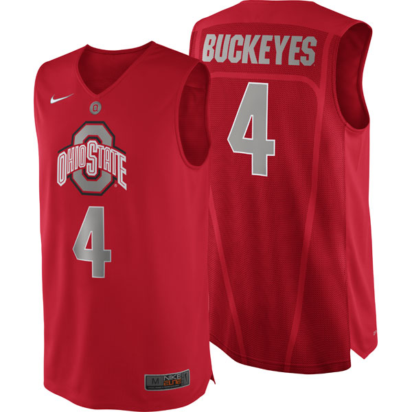
Ohio State will be wearing theirs against us during the February 5th home game. Theirs look like so:
Other teams to wear them include Texas, Gonzaga (who wore them against Butler), Marquette, Duke, North Carolina, Villanova, Kentucky, USC and Georgetown.
And to think we complained about Adidas so much...
January 22nd, 2013 at 4:16 PM ^
January 22nd, 2013 at 4:16 PM ^
Complete with sweat lines!
January 22nd, 2013 at 4:17 PM ^
But do they have "revolutionary" ultra hi-tech low weight extra strength tight fitting moisture wicking fabric?
January 22nd, 2013 at 6:00 PM ^
They are 1/600 of an ounce lighter. Could be the difference between the first round and the national title!!
January 22nd, 2013 at 4:18 PM ^
Always wished he stayed longer...
January 22nd, 2013 at 4:23 PM ^
January 22nd, 2013 at 4:24 PM ^
As ugly as they are, I'll take bad design over poor performance any day. Bet they don't rip.
January 22nd, 2013 at 4:47 PM ^
Burke's in the Minnesota game was the first time that I recall.
What I don't like about the new Adidas jerseys is that EVERY Adidas team uses the same format/style. Weren't we supposed to have some exclusive contract giving us exlusive gear? Our shorts look just like everyone else just a different color. Same with the jerseys for the most part.
I liked last year's uniforms...no reason to change them.
January 22nd, 2013 at 5:22 PM ^
I think there was something like four ripped jerseys in the Minnesota game alone.
January 22nd, 2013 at 8:22 PM ^
ㅅㅅㅅㅅTHIS
I actually think these are some of the best uniforms we've had in a while. I think they look great. I bought my son the blue away uni and it is fabulous...
But they are not original! The more teams that wear them, the more ridiculous it seems. Addidas can't design more than one style per year? I'd much rather have something that is uniquely UM but not as nice than something that is slightly better but just one-of-many.
This is Michigan fergodsakes. We can't demand our own uniform style?! I was honestly stunned when I realized this.
January 22nd, 2013 at 4:28 PM ^
January 22nd, 2013 at 4:30 PM ^
January 22nd, 2013 at 7:31 PM ^
January 23rd, 2013 at 12:00 AM ^
Thanks for the complement.
January 22nd, 2013 at 4:42 PM ^
The jerseys Gonzaga wore against Butler were hideous.
January 22nd, 2013 at 4:44 PM ^
I didn't like Gonzaga's during that awesome Butler game, Ohio's look silly too.
They look like (and should be) PRACTICE jerseys. The technology is great and that's when you condition and sweat the most. Also in practice it's good to convey the message that the logo on the front and the name on the back (school name) are more important than any individual. A coach can keep track of 15 guys unlike football where you may need the names on the back.
Practice - Love
Games - Absolutely hate.
January 22nd, 2013 at 5:21 PM ^
January 22nd, 2013 at 4:54 PM ^
Yes, once again, Nike and Adidas both make very ugly uniforms. It's up to the school to take a stand against bad uniforms.
As for those mortified that we had a lot of jerseys rip...please name any other game that such a thing has happened. No? None. Ok, so then it miiiiiiighhttt have had something to do with Minn grabbing jerseys more than normal. Or, maybe a bad run of material.
This is not a Nike v Adidas issue! It's a choice made by athletic departments who can refuse to wear crap.
January 22nd, 2013 at 4:56 PM ^
January 22nd, 2013 at 5:29 PM ^
January 22nd, 2013 at 8:25 PM ^
The Fab Five *did* have plain blue tshirts on over their jerseys for warmups during their sophomore year. It was their silent protest against all the companies making money off of everything they wore.
January 22nd, 2013 at 5:07 PM ^
Fab 5 shorts would make me feliz. I still own the original pair of Nike block M shorts, but kinda snug.
January 22nd, 2013 at 5:08 PM ^
Appparently they still think MSU needs to change their school colors:

I have no idea for what game they plan on wearing these.
January 22nd, 2013 at 5:14 PM ^
"GO GREEN!"
"GO BRONZE!"
January 22nd, 2013 at 9:29 PM ^
"300" was a bad movie.
January 22nd, 2013 at 5:18 PM ^
I like the bronze. Its become an alternate color the way Nike incorporates it into our regular jerseys. Sort of like Duke using alot of black. We're wearing them against Indiana.
January 22nd, 2013 at 5:37 PM ^
Duke incorporating a neutral color (black) to accompany their normal colors is one thing, but neither of these colors has had anything to do with MSU for decades. Plus substituting the team logo for the name on the banner of the jersey just looks awful.
I mean, if Nike offered a green on bronze jersey, you'd get violently ill, wouldn't you?
January 22nd, 2013 at 5:55 PM ^
Design wise, MSU's new alt jersey is one of the more complete kits, thanks to its logo actually being well designed (as compared to Duke, Gonzaga, or that terribly proportioned sliver, black, and red monstrosity).
On the rack, I think it'll sell well. Logos are much more compelling than word marks.
January 22nd, 2013 at 6:01 PM ^
Well yeah, a bronze base to a jersey would look awful, but I like it as it is right now: Outlining the numbers on the regular jerseys and the alternate jersey once every year or two. I know it hasn't been part of MSU but its part of the branding that Nike is doing for MSU. They already changed the font and the shade of green that we use along with completely getting rid of the block S.
January 22nd, 2013 at 7:34 PM ^
It would be really weird if Duke used this guy.
January 22nd, 2013 at 5:48 PM ^
January 22nd, 2013 at 5:49 PM ^
January 22nd, 2013 at 6:30 PM ^
Those look like practice jerseys.
January 22nd, 2013 at 5:09 PM ^
No offense to the players of those team as they tried their hardest and were victims of early fallout. But seeing those uniforms make me think about those dark times and get a bad feeling in my stomach. May we never see anything like that again and make sure our building is never invaded again.
January 22nd, 2013 at 5:15 PM ^
...having the logo on the chest like that really looks amatuer-ish, as if the didn't have the time or money to design actuall basketball jerseys and settled for some t-shirts with the sleeves ripped off.
January 22nd, 2013 at 5:15 PM ^
January 22nd, 2013 at 5:19 PM ^
They look like knock-off jerseys
January 22nd, 2013 at 5:26 PM ^

January 22nd, 2013 at 5:46 PM ^
January 22nd, 2013 at 5:53 PM ^
January 22nd, 2013 at 6:03 PM ^
This has to be Addidas' fault somehow as they, apparently, can't do anything right.
January 22nd, 2013 at 6:11 PM ^
I'm glad Ohio is wearing that trash for when we kick the shit out of them.
January 22nd, 2013 at 6:24 PM ^
FAB FIVE SHORTS! YES PLEASE! They are the most iconic shorts i can think of...even to this day.
January 22nd, 2013 at 6:26 PM ^
Dont give a shit what they look like..Fuck Addidas, I want NIKE.
The tearing of the jerseys and those fugly socks are the final straw
January 22nd, 2013 at 7:10 PM ^
January 22nd, 2013 at 7:28 PM ^
I always really liked the shorts from those old Nike uniforms. Had both the maize and blue versions (and the matching Jamal Crawford headband) for benchwarming in my hometown rec ball leagues circa 1999-2001.
January 22nd, 2013 at 9:36 PM ^
Crawford was on the forefront of the headband revival. I remember going to a game during his days when the athletic department gave away promotional SBC headbands. They were incredibly tight. I got a headache from wearing mine too long.
January 22nd, 2013 at 8:30 PM ^
+1 for the honest "benchwarming" part of your post. It makes all the difference to what you wrote. Before that, I thought you were a chump. Now I think you are the sort of lovable-loser type of chump. And although I may sound like I'm making fun of you, I'm not.