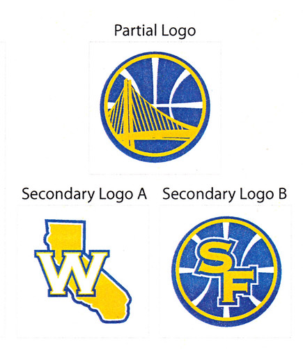
OT: Golden Sate Warriors new logo/colors.

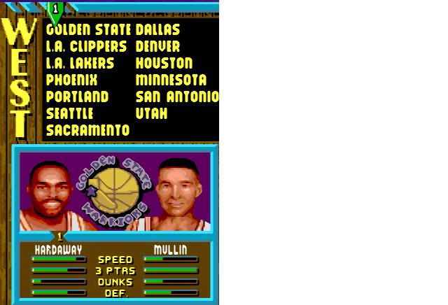
So I've been a Warriors fan since Tim Hardaway, Chris Mullin and the young C. Webb in the early to mid 1990's. I've always hated their Navy and Orange color scheme, and I'm glad they are going back to Blue and Gold. I also dig the new bay bridge in the logo, even though it won't be finished until 2013. Hopefully the upcoming ownership change can lead to better results on the court, as long as they lose to the Pistons every time they visit Oakland.
http://espn.go.com/espn/page2/index?id=5298902
![]()
From DOWNTOWNNNNNNNNN
HE IS ON FIRE!!!!!! To be young again.
Is it the shoes?! I played this game for hours. I love the scientific break down of the players' skills.
What I loved most about that game was you could knock the guys on the other team down and steal the ball with no repercussions (no fouls in that game). I almost shut a couple teams out doing that.
The Supersonics with Payton, Kemp and Shrempf were an absolute powerhouse in that game.
I've hated the navy and orange warrior logo with the lightening bolt since it was unvieled, so this change makes me very happy. I especially like the secondary logos.
http://farm2.static.flickr.com/1271/4709455484_31955d3f02.jpg
Why is the secondary logo 'SF?' Aren't the Warriors much, much more in Oakland than in San Fran? Or did they change arenas?
They're still in Oakland where they've played the majority of their games since 1971 (prior to that time they were known as the San Francisco Warriors after their move from Philly). So yes, the SF doesn't really make a great deal of sense, but the New York Giants and the New York Jets are still playing in New Jersey and use "NY".
I looked up the jersey and i thought they could have made it better, but still an improvement.
... they'll have the player's number inside:

As far as SF/Oakland? Hmmm.... SF is iconic for the Golden Gate bridge; Oakland is iconic for:

"Just win Baby"
I hear he got sick for this year's draft and picked players who actually made sense!
I think the new logo is supposed to be the Bay Bridge, which connects Oakland to SF.
I really like them. The color scheme is, as always, a great one and the logo looks classy.
This change should see them selling many more jerseys.
Their decision was largely based on response of their 'Throwback on the Hardwood' (or whatever it was called) series, where they wore their throwback 'The City' jerseys. Fan response was unprecedented and they sold mountains of the throwback gear, so it just made sense to update it as their main. A sort of modernized throwback, not unlike what the Chargers did with their powder blue uniforms.
A little bleh, but I'm no authority on NBA uniforms either. At least it's clean.
Sounds delicious
I do like the new jerseys though
When will Golden State be invited to the Pac 12?
Definitely an homage to the old "The City" uniforms of the '70s, which were awesome. The Warriors had great uniforms for a long time, until the switch to the ugly dark blue-and-orange lightning-bolt look. Warrior fans probably will look back on those uniforms like Piston fans do for the teal era.