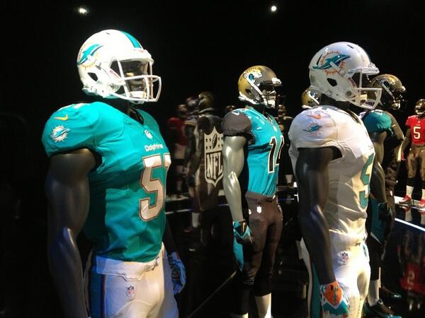
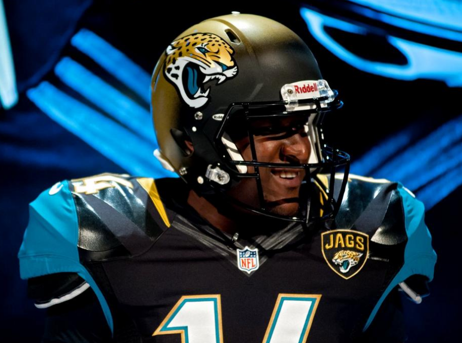
OT: Dolphins and Jags introduce clowniforms

The Jags don't have much tradition....
http://ftw.usatoday.com/2013/04/jacksonville-jaguars-new-uniforms-nike/

But the Dolphins sure do...
http://ftw.usatoday.com/2013/04/miami-dolphins-uniforms-redesign-leak-nike/
April 24th, 2013 at 10:22 AM ^
Those Jags uniforms look better than their current ones. The dolphins on the other hand should keep what they have.
April 24th, 2013 at 10:24 AM ^
"Clowniforms"? They look pretty normal to me as far as uniforms go, and I actually think the Jags one looks great.
April 24th, 2013 at 10:25 AM ^
Is the topic of football uniforms getting really stale for anyone else?
April 24th, 2013 at 10:43 AM ^
It is not getting stale because it has never really mattered a lot to me in the first place (except Michigan's). What I don't get is why now it seems like every time a team comes out with a new uniform someone creates a board post that says 'LOOK HOW TERRIBLE THESE UNIFORMS ARE' and yet they are usually not that bad.
April 24th, 2013 at 10:51 AM ^
Yes. This. Not every new uniform is stupid. Not every team can keep the exact same uniforms for all of eternity. Criticizing every single uniform change makes fans look like the boy who cired wolf. Now when something truly terrible comes out (i.e. Adidas zubaz basketball), the complaints get brushed off as old people just being haterz.
April 24th, 2013 at 10:54 AM ^
... of cried (cired) to read like sired and your avatar made me giggle.
April 24th, 2013 at 11:00 AM ^
Ha, Oops. I blame it on my jittery coffee fingers.
April 24th, 2013 at 11:40 AM ^
Not really. Players change, etc, but the uniform is a constant element of fandom. If you have good memories of your team wearing a particular uniform, you're probably more likely to want to keep that uniform. In this case, nobody gives a shit about the Jags, so any change is welcome. The Dolphins have a past tradition of winning in a uniform that didn't change too much over the years, therefore folks might be reluctant to see changes to their gear.
April 24th, 2013 at 11:11 PM ^
yet retaining some of the elements of their Tradition. For some strange reason, though, when I saw that picture depicting those new unis,
it struck me as something I've seen before, reminding me of some other "New Traditionalists" of the past...
April 24th, 2013 at 10:27 AM ^
April 24th, 2013 at 10:28 AM ^
They're pretty simple looking, but I tend to find beauty in simplicity.
The Jaguars helmets, on the other hand, look like there was a mishap on the painting line. Like a 4th grader discovered the gradient tool in Photoshop.
April 24th, 2013 at 10:28 AM ^
April 24th, 2013 at 10:29 AM ^
I guess I am the only one who likes them? They look pretty normal to me. Fins logo sucks but that has nothing to do with NIke.
April 24th, 2013 at 11:29 AM ^
April 24th, 2013 at 10:32 AM ^
The Dolphins uniforms look pretty much the same as the old ones, with the exception of the more "modern" logo. Not a clowniform.
The Jags black uniform with teal shoulders looks pretty nice, imo. Shoulders look nice with the matching teal panel on the pants. The reverse, OTOH, with teal body and black shoulders, looks a bit clownish. The helmet, also, fading from black to gold, is kinda weird.
April 24th, 2013 at 10:34 AM ^
XFL / Arena League look to me. Too many new metallic colors. Would anyone over the age of 17 or with a high school degree wear these in public (the Jags especially)? I mean, looking on the bright side, wearing one of those would make anyone look younger. I guess the Jags are just reaching for any type of relevancy whatsoever... has there ever been a more useless team in a pro league? They're just so.... boring. Always a few games below .500, no tradition, boring city, no "identity" etc.
I always liked the Dolphins traditional colors... very Miami. They should stick with that, although the alternates aren't terrible.
~Herm
April 24th, 2013 at 10:37 AM ^
Thanks Herm. Your advice on life's big issues is always so wonderful.
April 24th, 2013 at 10:39 AM ^
You don't have to thank me. I'm just making the world a better and brighter place.
~Herm
April 24th, 2013 at 10:34 AM ^
But like you say, I dont know a lot about Jags/Dolphins tradition where I would be morally outraged.
April 24th, 2013 at 10:34 AM ^
This was my 1st thought when I saw them. Not like/dislike look of them, but whoever thinks all Black for a Florida home game is a good idea needs to be fired. (now on to the looks part...looks OK but I've never liked same color jersey & pants)
April 24th, 2013 at 10:38 AM ^
also, i love how nike shows these uniforms in high contrast bright ligthing in front of a black background, since football is usually played either in daylight or under really bright lights for tv.
April 24th, 2013 at 10:43 AM ^
They'll probably look a lot better without Nike's "I'm a fukkin warriorzz" presentation.
April 24th, 2013 at 10:44 AM ^
The Jags two tone helmet is kind of lame (unless that's just a trick of the light) but other than that I don't think they're that bad. Never been a big fan of most NFL uniforms to begin with and these don't seem too bad.
April 24th, 2013 at 10:46 AM ^
Jags look good and I like the mostly white Miami helmet without the strip down the middle
April 24th, 2013 at 10:50 AM ^
The Jags were stuck in the early 90's (teal... says it all) and the Dolphins were the last of the early 70's look (Pats, Broncos, and Bucs of recent years)
I actually really like what the Dolphins did... they kept the core look (blue with the dolphin on the helmet) and didn't completely re-do their brand (like the Broncos and Pats... albeit to a much better look).
And I always hated seeing that dolphin wearing a helmet
April 24th, 2013 at 10:57 AM ^
Jags numbers & names font is gross. I don't see the fascination in going away from the norm with the numbers and names.
The accents in the Dolphins jerseys are too subtle in my mind.Either be plain, or go bold. None of this in between junk that might be cool a foot away from the jersey. When you have accents on something that cannot be seen 10 feet away, then why did you put them there in the first place?
April 24th, 2013 at 10:59 AM ^
I don't see anything wrong with the Jaguars uniform. It's pretty tastefully done in my opinion.
The Dolphins... I get where you are coming from. The whole "What if we put the Dolphin on the helmet like it was Shamu at Sea World?" thing bothers me the most.
April 24th, 2013 at 10:59 AM ^
Get off of my lawn.....rabble rabble
April 24th, 2013 at 11:05 AM ^
April 24th, 2013 at 11:07 AM ^
April 24th, 2013 at 11:13 AM ^
April 24th, 2013 at 11:15 AM ^
I can't tell what the jerseys look like enough to hate them because of that black backdrop in the promo photos.
April 24th, 2013 at 11:19 AM ^
That is a clowniform.
Then I guess we should wait and see how the Dolphins and Jags perform this year before making any conclusions on the new uniforms.
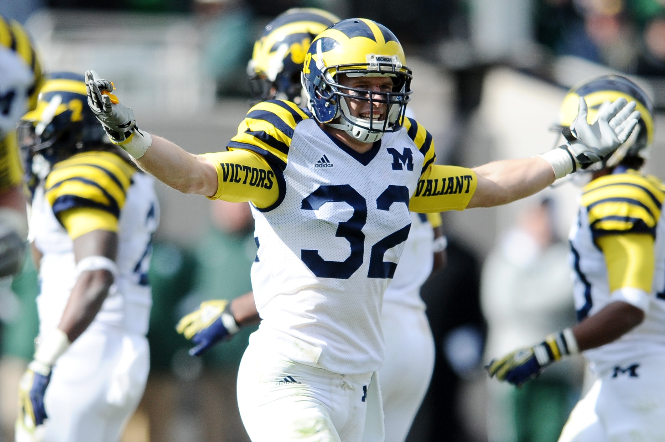
-The "bumblebee" was sick, but since they lost that game everyone hates it. Period.
Yes. Forever and ever, yes. Clowniforms suck, win or lose.
UTL uniforms were different than the bumblebees. I think they still sucked, but even if someone else did like them it wouldn't prove your point.
Yes, I would agree with both of those statements (although most beloved alternate uniform is not exactly a high bar at Michigan), but I still think you are wrong. The jersey's are terrible looking and people would feel that way regardless of whether we won or lost that game. Does it add to the negative feelings about the jersey's that we didn't win in them? Sure, but I don't think that is the determinative fact. Personally, I dislike them because the maize and blue stripes on the predominately white jersey look way too busy, especially when paired with the stripes on our helmets. I felt that the sugar bowl alternates were a much better version because there were fewer stripes on the shoulder, and the stripes were only blue (more similar to UTL, which only had maize stripes, not maize and white stripes).
TL;DR version: You are right in feeling that the loss to MSU exacerbates the negative feelings surrounding the bumblebees, but you are wrong to think that is the only reason people don't like them.
April 24th, 2013 at 11:28 AM ^
On that note, the new Jags uniforms are pretty cool. The Dolphins aren't bad, just not a fan of a dolphin on your helmet.
Have to seen the new Pelicans if the NBA?!?! Intimidating.
April 24th, 2013 at 11:35 AM ^
uniforms are upgrades. But I respect opposing opinions so I'm not going to downvote you.
Or you could be wrong
April 24th, 2013 at 11:46 AM ^
April 24th, 2013 at 11:54 AM ^
April 24th, 2013 at 12:03 PM ^
still an upgrade, but too much teal on the shoulders. I like the helmet much better than the prior version.
April 24th, 2013 at 12:20 PM ^

then, why, oh why, go so much more teal-y for the uniform? Perhaps they are flexible in their branding standards.
Also, this guy says hi and "Hey, my colors are grey and white!"