Official Document on Split-M Logo?
A while back I remember somebody on the blog linking to an official university document explictly stating that the "Split-M" Michigan logo is no longer to be used. Does anyone happen to still have a link to said document? I need to harrass a coworker about his non-regulation belt.
Also, get your shit together, si.com:
ESPN, this is closer, but still not quite right:
CBS knows that's up.
Damnit, Fox Sports!
I kind of like the Split-M logo. I'm not against it being used, but I would like the color of the M to be streamlined.
Yeah, I'm a fan myself. But the rules are the rules. We must protect The Brand* at all costs.
*No, this is not what Dave Brandon calls himself in the bedroom.**
**It totally is.
"Baby, just mellow out... while I perform some product placement..."
I was going to make a play on "splitting the M", but here at MGoBlog we're classier than that.
Is the blue block M frowned upon? I always thought either color was good to go as long as you didn't use the split M.
...but technically, yes, it is very frowned upon. The official logo of Michigan is now a maize block M. According to their logo standards, blue is meant to be used as the backgroud color for the M if anything. Believe me, out of curiousity I read the document on proper usage and design of the logo and it got crazy weird and anally specific.
Edit: Link? Link.
I'm not saying you're wrong, but then why does the basketball team have a blue block M on their maize uniforms?

March 27th, 2014 at 11:35 PM ^
The article I linked clearly lays out the official guidelines. As far as Adidas is concerned with our jerseys (and really any athletic apparel company and their respective schools), I imagine their response when given the precise official colors and logos goes something like this:


I honestly can't imagine the official logo in maize would show up very good on a basketball court. Like I said, I tend to prefer a blue block M. Seems like it would make sense for the university to just come out and say they have multiple official logos, rather than pushing the maize one that they don't consistently use themselves.
For what it's worth, according to a friend of mine who works for a non-revenue sport at U of M, she said that everyone in the athletic deparment got a random email from Dave Brandon at 3am one day within the past couple weeks about him stressing uniformity in the usage of our logo. I dunno, maybe a crack down is coming on all of those logos we have out there that seem to conflict with our official one.
The block M in maize is the official logo for Michigan, so besides espn, DB needs to fix the logo at half court in Crisler.
Why does Rivals, 24/7 and such use the old logo? It bothers me
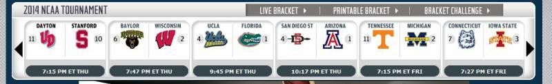
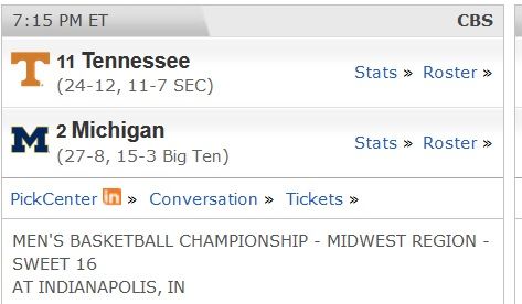
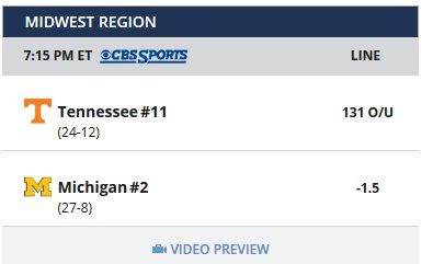
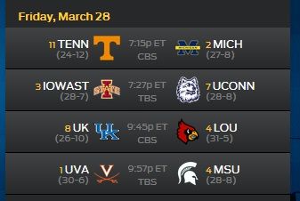
How ironic for all our angst over the purity of uniforms, logos and such that our "M" is displayed three different ways in four screen shots.
They seemed to get the "T", U Conn & Iowa State right each time. Where are the brand police when you need them?
I think they got UConn wrong every time, after seeing the new logo when we played them in football:

I am also a fan of the split-M logo. All my dad's retro Michigan gear has the split-M.
I think you are referring to this document, which was posted on MGoBlog only as an image taken from Kyle Meinke's twitter account:
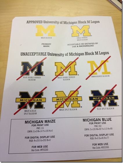
There's also the official style guide, which can be found here, but it does not specifically mention the split M.
Yeah, that's the one. Thanks!
Of the bottom 6, they all look fine to me except that ugly thing on the far right of the top row. I actually really like the far left bottom row one.
Thankfully Brandon doesn't control Bolivia or I'd be gone.
I don't know who this Bo guy thinks he is wearing that "ugly thing", he needs to get on board with the brand and stop ruining Michigan tradition.


haha. I still don't like it on paper :)
Curiously, the newly redone bus stop by the dental school also uses the split M.
Maybe if college football players were paid, this wouln't be a problem.
/s
The subject came up in an older thread here.
http://mgoblog.com/mgoboard/acceptable-and-unacceptable-block-ms
What is the difference between the Texas T and the Tennessee T? I feel like I usually know if it is a Tennessee car decal b/c it being a T and it is usally a brighter orange. Hats and other cases I really have no idea which school the person is for. I then chuckle and think of how that would piss off the marketing people at either school.
It could be worse... we have a member on here who was a Missouri student. Missouri uses a nearly identical yellow block M on a black background (which can look very similar to dark blue). IIRC he said he would get asked while he was wearing a Michigan baseball cap, by Missouri fans... in Missouri's stadium.
Tennessee's T has rounded 'pits'.
Texas's is bold, passionate, competitive, loyal, unique and innovative.
Tennessee's stands for initiative, selflessness, compassion, collaboration, civic responsibility, leadership.
(Of course, there are other differences too...)

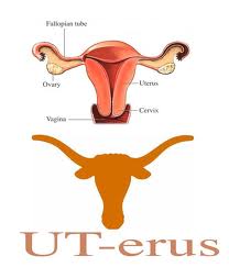
Other than the Texas logo looking like a uterus, they're almost the same.
http://vpcomm.umich.edu/brand/style-guide/design-principles/colors
I made t-shirts for an org at Michigan not that long ago. Probably violated tons of these.
... one of the hardest things to do is create consistency with your logo once you change it. If you change it often or allow multiple versions to be approved... good luck.
Is if you persistently email all of the places that have the wrong logo, with the links to the VP of Comms office and the correct logo. If you bug them enough, it will get fixed. Yahoo! fixed it. ESPN fixed it (Blue block M is actually better looking on white backgrounds). SI at least moved to one that was in the 20th century from their 1996 style 8-bit abomination.
I'm OK with both, but prefer the simple block M without "MICHIGAN" in the middle. This is Michigan and people should see the block M and immediately know to whom it belongs.
I don't know if it differs for the Athletic Dept. or not, but here is the University Brand and logo useage style guidelines.
Personally I like the bottom left corner one best, blue M with yellow split. Even the ugly skinny one looks fine when it's embroidered on hat
Aren't they contradicting themselves with the whole blue block M in the center of Crisler, then???
"Goddammit!...................And f*&$ Adidas!"

Everything about the logos can be found here:
March 27th, 2014 at 11:37 PM ^