M Jersey with B1G patch at Media Day (w/PIC)

Not bad. Not bad at all IMO. The 1G could be a little more Maize and not gold, but other then that, I don't mind it too much.
Thoughts?
http://btn.com/2012/07/27/clothes-call-big-ten-media-days-edition/

Kovacs got dark
Stupid Boba Fett.
wait, wait, wait. Except Boba Fett. No matter how sure I am, I never risk the Fett man.
symmetrical
Jeez what happend to Kovacs?
Why do the numbers look so pale?
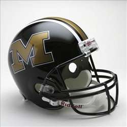
The lighting maybe? It is weird though, they look like a lighter shade than the wings/pants. Also here's a pic of our helmet for next year. Basically right back to where we were 2 years ago, no longer messing around with numbers or grey facemasks (good call imo).
Que the GIF of the Adult Swim guy having an epiphany...
And the blue is glossed. That effect will probably be hard to photograph. Anglique Chengelis is going to love this; she's had a couple of ideas along this line before. If it is okay with Angelique, I am going to give it an open mind until I see it for myself.
(I am just guessing; in the photo of jersey #32; is that a new helmet or an old one? I think it may be an old paintjob. Again, just guessing.)
the rumblings from the ground that I have heard, is that the helmet is more metallic than flat.
that's sort of what I am getting from that picture. That a more metallic maize is what is reflecting so much direct light in that image.
Not as bad as I thought. I was assuming they would just slap on the generic logo like a bowl patch
Not as bad as I thought either. I didn't think they would incorporate maize and blue. Thought it would be a big blue, black, and white patch.
Personally I like it. I think it blends in with the jersey pretty well and doesn't stick out like a sore thumb. I do agree that the numbers look a little off color wise, but am glad that the blue facemasks are back.
I have always hoped that they would do the one and only thing possible to improve on Michigan's home jerseys, and distinguish Michigan from the rest.
And that is, to go back to the ever-so-slightly-smaller numbers and the older number-font from the mid-sixties:
Jack Clancy:

1963 team photo with Bump:

I always disliked seeing numbers so large that Denard nearly had to tuck them into his pants:

Adidas already did the smaller numbers and it looked awful. It made me want to vomit every game. Welcome to the modern world of bigger numbers!

That being said the B1G patch combined with the Adidas logo is awful. Disgusting. I hate it. I guess its a welcome for me to the world of money making sports, where cash trumps all.
And I couldnt be more unhappy with that patch, the adidas terrible logo (why do they have to include the name of their brand? o thats because they are 10 times crappier than nike) and the legends patch. We might as well send our unis up to the ann arbor assisted living home so they can just make individualized quilts to replace each player's jerseys.
Bigger is much better. For me the numbers on the Nike jerseys were too small. The recent Adidas ones are almost big enough. I came of age in the 70s when the numbers were really big – not as big as Ohio's, but bigger than nowadays. It's a little easier to see who's who, both in person and on TV.
Most traditional NFL jerseys have right-sized numbers: Packers, Browns, Saints, several others.
Few things could better demonstrate why I am right. That's proper scale. Particularly so that it doesn't make smaller skill position players look like the junior varsity. If Michigan wanted to look like every other team in the modern world, we'd have gone to helmets that look something like this a long time ago:
I prefer "traditional" uniforms and "radical modern" offensive schemes.
Yea cause nike doesnt put their logo on anything.
I am actually a big fan of the having the B1G logo on the jersey.
I've ived in the midwest all my life, so B1G football is a huge part of my life, and it is great to see all the teams embracing the B1G and midwestern culture, that makes us unique as a conference.
PS: I also am a fan of having the B1G logo on the field as well. Even a traditionalist program like Bama has their conference's logo on their field.
is fine. Small, more or less proper colors in an always unused part of the jersey. I will not complain about this at all.
Couldn't agree more with you. There is a reason that when trying to get out of the BiG XII, Missouri's first choice was the B1G over the SEC. It's because this is the greatest conference in College football. Celebrating it by putting a small logo on the jersey is not going to ruin our tradition, it will build on it.
Just one. Somebody has to choose. You only get one:
- American flag
- B1G
- Block M
- "Legends" patch(es)
- Bowl patches
- Other
Choose. Just one from that list.
Because there is already one logo on there, and we get paid by adidas to put that one on. Any other logo, patch, design, etc.; you gotta pay $24 million a year to put it on.
Seems like a fair deal to me.
I'm glad that it's small, but I don't care for it. I like simplicity. Anything that makes our uniform look busier, I'm pretty much not a fan of.
I've never cared for having the swoosh/three stripes on the jersey either. If the NFL doesn't allow it on the shoulder, why does college football?
But are conference logos mandatory on all uniforms and fields now? And if so, why?
I like the helmets. I'm not sold on the B1G logo on everything. I don't get why the B1G is forcing this branding; everyone knows who is in the B1G. We're not the ACC or Big East. Couldn't the athletic directors just tell them to go eff themselves and we're not putting your logo on our jerseys? What are they going to do, kick us out? Seems unlikely.
Not a fan. It just looks out of place and makes the jersey look asymmetrical. Unecesary clutter.