
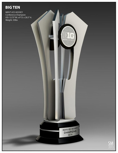
It. Looks like. A trophy. Of some sort.
Dick Butkus would like to speak with you.

Dick Butkus looks like he's about drop some butt nuggets.
Props for making me almost spit out a mouthful of Dr Pepper at work. That was a very funny sentence.
A little Metamusil will make things easier, Dick.
Looks like the head of a mace...cool...honestly I have seen far worse trophies out there...this isn't so bad at all.
It's a trophy. I'm not sure what you expected. If this is a new low, you must not have hated the division names nearly as much as everybody else.
A traditional one like these-

Why would you create a traditional trophy for a new conference...What "tradition" would it have behind it.
One that looks like a hockey trophy and not some artsy-fartsy junk being sold at Pier 1 Imports.
Sorry I'm not sorry.
don't mind it too much, just seems like an average trophy. Though as a hockey trophy I would have liked it to be more "cup" like if that makes sense.
A few pieces of metal on wood with a hockey puck split in half. Doesnt look to bad to me.
I really don't think its bad at all. Pretty average looking as far as trophies go really.
a few avant-garde bottle openers left from a pabst project - seemed like a good time to use them up.
I ate a. Turkey panini. For lunch.
It's a little underwhelming. I was expecting to see something as bad as the original NU/Iowa trophy.
To say that's a "new low" is ignoring a lot of stuff or is the height of overreaction or both.
it's just a trophy, and since it is a new conference, they cannot have a traditional one...You have to start somewhere.
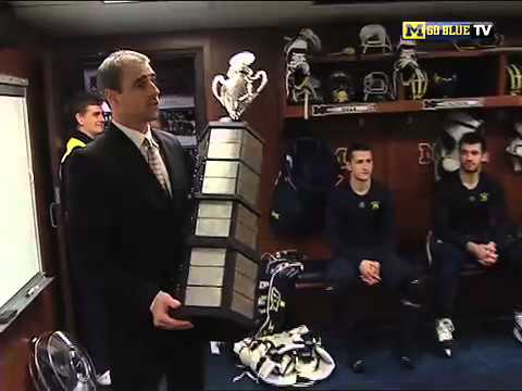
30" tall and 35lbs. That's still gonna feel like a cup when it's hoisted.
Here's a nice design we could've gone with....maybe put the names of the winning teams on the side. Call it "The Lord Delaney Cup" or somehing.
I love the Stanley Cup, but any attempt at making a new trophy look like it would be lame.
Well, it's better than this
...too many jokes...overload....ahhhhhh!
or lengthens if you prefer.
But it's real, and it's spectacular.
ever!!!
They should have made something like this

I too would have liked more of a cup design but they were obviously going for modern/avant-garde. It's OK...but would look a lot better with a guy in a maize & blue sweater holding/lifting it
Actually I think that's a pretty sweet trophy, be happy there's not a giant Dr. Pepper logo on it.
by next year. It'll be something like "The Dr Pepper Trophy, presented by Farmer's Insurance"


Worse still:

Modern trophies are going avant garde or trying to incorporate some of the aspects of the school or conference into things. It's not bad. The Tol//BGSU trophy is fantastic.

Thank you for saving me the google search for the Cy-Hawk trophy.
Sponsored by?
Home City Ice, of course. A subsidiary of Arbys.
Are you "guthrie" from the scout site?
I think we're all still stinging a bit from yesterday and feeling a little bitchy, because calling this not-so-bad trophy design a "new low" is a stretch. It's definately more modern than classic in design, but it's not horrible from an aesthetics perspective.
What did you want them to do, not have a trophy?
Oh come on, there's nothing wrong with that. At least they're not trying to pretend it's some timeless, classic showpiece. It's a trophy. It has to look like something.
"New low" status as far as the conference is concerned has to somehow be worse than Maryland and Rutgers. This ain't it.
Looks like a flanged mace head. Put a stick on the bottom and you have:

Cool by me.
I hope no one saw you take it.
I have no problem with the design. I think it looks better than the Broadmoor trophy and the Lamoriello Trophy.