Block M font
graphic designers et al., what font is used to spell out Michigan in the middle of the block M logo.
like here:
http://www.google.com/imgres?imgurl=http://blogs.villagegreen.com/detro…
December 16th, 2011 at 11:22 AM ^
December 16th, 2011 at 11:21 AM ^
The University no longer approves the Block M with the text. See http://ur.umich.edu/0405/Jan24_05/13.shtml
December 16th, 2011 at 11:21 AM ^
that's ok. i'm trying to help a friend use it for a baby announcement.
December 16th, 2011 at 11:24 AM ^
Is it a little piece of ish?
December 16th, 2011 at 11:27 AM ^
... Baby annoucements are now exempt from the University's branding standards? What's next? Football uniforms?
December 16th, 2011 at 12:01 PM ^
Everybody knows baby announcements are harmless. Its wedding invites that are the gateway stationary. Besides, that Block M is becoming less sacred by the day. Mascots, rock music, and general what have you...
December 16th, 2011 at 11:24 AM ^
"U of M is Number 1 in Media Rankings" using the orphaned logo.
December 16th, 2011 at 11:38 AM ^
Using Word on my laptop with ~200 fonts, it looks most like:
Estrangelo Edessa
Ligurino
Opel Sans
Each has a slight problem - G shape wrong, A without a flat top, etc. But all have the flared out M
I would go with Estrangelo Edessa.
December 16th, 2011 at 11:57 AM ^
thanks. and thanks to siz zero as well.
December 16th, 2011 at 11:53 AM ^
It's a dead logo, as far as the university is concerned.
At first glance I'd say it's a non-condensed Futura.
December 16th, 2011 at 12:25 PM ^
With a thin stroke in Illustrator so that it's slightly heavier than regulation Futura Bold. It's not quite as heavy as Futura Extra Bold, which is like Mark Mangino heavy.
http://www.fontshop.com/fonts/singles/linotype/futura_std_bold/
However, Yo Blue is correct: this version of the block M is no longer approved by the Athletic Dept, and is no longer used.
December 16th, 2011 at 12:24 PM ^
It looks very, very similar to Futura Bold. I used the logo to find a match at WhatTheFont.
December 16th, 2011 at 12:51 PM ^
is what they should do to our endzones. What is there now, just looks like 'generic football field.' Nothing distinctive whatsoever. The split portion of the Split M even looks like an endzone.
December 16th, 2011 at 12:54 PM ^
I'd like to see us use a variant on our pre-Fab 5 basketball uniforms - with the Block M slightly embiggened and a similar but slightly smaller block font for the I-C-H-I-G-A-N. Maybe do the M in yellow with blue trim and have the rest of the letters be solid blue. Granted, that wouldn't work for an end zone...
December 16th, 2011 at 1:52 PM ^
like the numbers on the helmets too, which would be a plus.
the steelers went to a similar font, futura, when nike was all Kordell Stewart crazy, and i think it looks good.
December 16th, 2011 at 5:38 PM ^
Personally, I've always liked the simplicity of our endzone design. I'm not sure how a design that says "MICHIGAN" could be considered generic.
December 16th, 2011 at 6:32 PM ^
I always thought that the Buckeyes did it better; there is some utility in being able to say, "the Ohio State endzone or the Buckeyes endzone?" Easier, sometimes, than north or south:

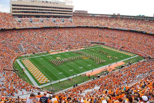
There are lots of better endzone designs in college football. Tennessee's iconic checkerboard:
Iowa's black and gold:

Illinois' helmet logo:

And even if you are a pure-simplicity fanatic, there are the archetypal Pitt/Notre dame diagonals:

December 16th, 2011 at 7:38 PM ^
Sorry Section 1, but Michigan's, imo, is superior to all of those.
December 16th, 2011 at 8:01 PM ^
I'm not exactly complaining about it. The simple block M at midfield is pretty much perfection. But home-team fans sometimes are too satisfied with the status quo. It is good to get out and see other programs, other teams, other stadia. We don't have a monopoly on every good aesthetic idea.
December 16th, 2011 at 12:51 PM ^
Not really - this pre-dates his hire, but this definitely rates a mention. From the University's graphic branding guideline web page:
http://www.logos.umich.edu/standards.html
COLORS:
The Seal may be printed in black and white or two-color (blue and gold). Do not use the three-color seal with the **red**. (emphasis mine)
U-M's graphic designers get it.
December 16th, 2011 at 4:59 PM ^
What is this "gold" they speak of?
December 16th, 2011 at 2:18 PM ^
From the UM website:
TYPEFACES:
The typeface used in the U-M wordmark is “Book Antiqua.”
December 16th, 2011 at 2:52 PM ^
that's available from Microsoft.