Athlon has Michigan 5th
Ohio State ranked at 3rd? They are bullish on recruiting rankings it seems.
http://athlonsports.com/college-football/athlon-sports-2016-preseason-c…
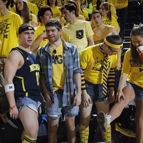
When will publications finally learn to stop using the split-M logo?
Dave Brandon was still around to call out the people still using the split M.
Sent from MGoBlog HD for iPhone & iPad
I wouldn't hire him to be the pooper scooper.
In case Dave Brandon is reading this, I would personally hire him to be the pooper scooper.
he would find a way to screw that up
Fecal Waste Containment Director?
All the rage against it originated with Brandon's desire to have a uniform "brand".
/old
It's also objectively a weak logo. It's busy, it appears to be a crossed-out M, and the "Michigan" font on the bar isn't used anywhere else. The block M is a far superior logo.
And regardless of Brandon's overemphasis on branding, it's also kind of dumb to have two different block M's representing the school.
It's only beloved because it's old. Imagine the class of 2016 was proposing installing that M as a brand new fixture in the diag. It would never be approved because it looks awful
But I'm getting to that age where I'm starting to feel nostalgic about things. When I was younger the split-M logo was everywhere, and so for me seeing it reminds me of happier and simpler times.
It would not shock me if random nights of drug-infused anal action fell into the same category with you. Ahhhh...those were the days.
It's a beautiful M.
the split M just reminds me of Starter jackets and Zuba pants
The split M is horrible. People should know that when they see the maize M, it's Michigan. We don't need to put our name on our logo.
with the split M logo on his avatar.
Personally, I like the split M, for the same reason as Mad Hatter - it's something I grew up with. My first wool winter hat had the split M logo on it.
OOOOOOOHHHHHHH I'll bet you think you're sooooooo clever! I did not create the avatar, bro. I chose it because of its hilarity, not the awful split M logo. I, too, grew up with the split M, but that doesn't make it cool.
Sent from MGoBlog HD for iPhone & iPad
This is my pet peeve. I hate it!
Now....not so much.
Sent from MGoBlog HD for iPhone & iPad
That was a much anticipated publication before the internet. I think I memorized every D1 roster from the Athlon Magazine each year.
Yes, it oficially announced the start of football season for me.
Seems like it would come out in July - I'd be reading it up north somewhere every summer.
the free meat sample lady standing around holding a plate with small pieces of meat on a toothpick.
Small pieces of meat for a 12 year old with a toothpick?
Nice.
When I was 12, I wanted any woman on earth to touch my small piece of meat.
Any luck since then???
/asking for a friend
40+ year old me eagerly awaits the free food samples at the local Costco & Sam's Club.
you've got to do something to make that membership fee worth it.
Sent from MGoBlog HD for iPhone & iPad
I love Mgoblog and HTTV, but they're a little limited when it comes to coverage of the Pac 12 and other conferences.
Although, as we approach about 200% funded for HTTV, surely there is now sufficient money to at least get a little sidebar about other conferences in there. I mean, even if the Pac-12 coverage amounts to a line to the effect of "Where Mike Riley Used To Go 6-6 A Lot", it's something, right? It wouldn't be Athlon-level detail though.
Um, okay but ONLY if not a single page of M coverage is dropped to make room.
That was my bible. Like Christmas when it hit the stores
5th, not bad as they are only 4 slots away from our eventual finish!
Too soon.
I know it didn't do much for others but I officially moved past that game once we clocked them in 2014.
Sent from MGoBlog HD for iPhone & iPad
"Over" Appalachian State? Noooo, I don't think I'll ever get "over" Appalachian State. Those wounds run....pretty deep....
WD was about 8 when they lost that so Im sure it's easier for him to get over. I was in college and I'll never forget how devastating that day was.
I remember it.
Sent from MGoBlog HD for iPhone & iPad


