ANOTHER jersey for the Bama game


Is it bad that I was a critic of the Road Legacys and I own one just to complete the collection?.....
Not according to Dave Brandon. In fact, according to him, you're the Ultimate Michigan Fan!!! (!!!).
I must be super ultimate since I have the receiver gloves as well.....
It's an addiction, I know.
Actually, I think it would be awesome to own them all. It doesn't mean I think we should be constantly changing because it's pretty much destroyed our tradition of classic uniforms.
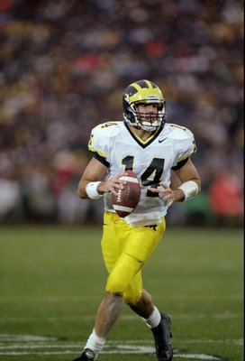
I love my all white #1 jersey. You don't need maize stripes or huge block M's everywhere. The maize trim and blue #1 signify everything - classic, tradition, dominance.
While I love the classic look of the uniforms, and that will NEVER change. I think that ONE alternate uniform a year wouldn't hurt. It's a new day and age where recruits love this kind of stuff.
If it brings great players to Michigan who want to say they wore that special uniform against notre dame or alabama then fine with me.
The only thing I'm not crazy about is wearing the special uniforms against the big 3 rivals. Those games should always feature the standard and classic uniforms. THAT is paying homage to the past IMO.
Okay, I've actually digested the whole article now, and there were some notable statements:
The article claims that Michigan will wear "standard home and road uniforms for the rest of the season." If this is true, fabulous. I'll take a single alternate road jersey every year in exchange for consistency the rest of the time, especially if they follow through on the promise to drop the helmet numbers.
The article also suggests that there's some work going on to "normalize" the colors of maize. I am nervous about this. If they change the helmet wing color (they've said they're changing the paint, but we'll see about the color) I'll be very unhappy. Michigan's helmets have been fine. And back when I went to games, just before Nike started putting tackle twill numbers on the jerseys, everything looked great and matched, even if the basketball and hockey uniforms were not consistent with football.
So we'll see. Playing with colors is nervous work.
Hopefully it's just to make the maize the same tint across all the parts of the uniform.
At the Purdue game last year, when it was cloudy but not dark, you could clearly see 4 different tints of "maize" on the uniforms: the helmet wings, the helmet numbers, the jersey numbers, and the pants. It looked amateurish, quite frankly.
I love the non outlined numbers and the block M's on the shoulders, just wish there wasn't the (neon) maize stripe.
i guess i like the team emphasis of the block M on the shoulder and Michigan across the back (instead of players name on the back/# on the arm)... these are def better than the UTL/ MSU bumblebee disaster, but i still dont like them more than the real uni.
...it's not about the money but the national exposure so why in the name of fuck wouldn't we want our ACTUAL uniforms there?
Which one is Dave Brandon?
A. B.
B.  C.
C. 
4000 Conqueror of the Internet points for C.
A quote from the Urban Dictionary:
|
ass clown (ás kloun) n.:
one, who, through the fault of his parents conception, is a skid mark in society's collective underwear. |
EDIT: I don't think I'm down with the idea of collective underwear. Maybe selectively collective underwear.
Maybe because they have Sugar Bowl patches on them?
The players love them. Isn't that what's most important? They are the ones that are going to be wearing them.
Frankly I'm relieved. After today's assorted shenanigans I was worried they'd look something like these.....

Those are Penn State's.
Too soon?
Am I the only one who hates "MICHIGAN" on the back, above the numbers? I think it looks juvenile and tacky as hell...no thanks
From the article, I don't think that will actually be on the uniform. It appears to be a placeholder.
Maybe make that huge maize stripe blue and put three maize stripes and i would take it for the road jersey.
Is this torture Michigan day?
I thought PSU was being punished, not us.
Just sayin'.
Do. Not. Want....
Hot garbage.
I'd be willing to bet that will be last names. They're just using MICHIGAN for the prototype to show what it would look like without including an actual "student-athlete" in the advertising.
That would be lame.
I like them. Am I that crazy?
Your skin is blue, so...
These look like something I would see at TJ Maxx for $12.99
Call me un-patriotic but I don't like the American flag on our uniforms or helmet. I like the alternates though. Would be a little better if the yellow across the shoulders was kept white.
I call you an unpatriotic but, per your request. j/k
I too, while not being anti-american, really don't like the American flag on our uniforms or helmet unless it is a very special occassion.
Man, they don't miss a beat. MDen already has them up for preorders!
........gotta go get my credit card.
The Gloves are way cooler than last years gloves.
The yellow shoulder stripe is too much, reminds me of one of the generic uniforms you could create for NCAA football 2005.
As for the helmet paint, I am sure it wont change too much. I am sure someone along the line would put a stop to it if they wanted to change our helmet too much. I am praying it wont be a Matte color since they want it to stand out more. Maybe it is going to have little sparkles in it that makes light pop off of it more, or its a stronger paint because of the wear and tear we put on the helmets last year.
I can't wait to see the UMASS Mars game jerseys
The receiver gloves will be on sale at MDen tomorrow morning as well per MDen facebook.
I just want the nike home and away uniforms worn circa 1997. Plain and simple and traditional.
The home uniforms that year were traditional, but the away ones were kind of garish. I didn't like the outlined numbers and two-toned neckline.
To me the best looking uniforms were always the clean look. The white out unis that Texas, Oregon, State, and other schools have always looked great to me. Keep it simple. Our football will be the best looking thing on the field anyways...
Oregon is your go-to "keep it simple" school?
The mid '80s away unis were the best.
I just want the nike home and away uniforms worn circa 1997. Plain and simple and traditional.