
Ypsi Strippers?
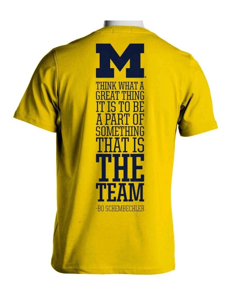
Forget about all that. Just try to diagram that quote. I dare you.

These are actually much better than the last three years. I might do the opposite of what I've been doing. Buy the shirt, and not buy the tickets.
April 14th, 2014 at 10:10 PM ^
They are embarrased by the crappy schedule. Don't want to show the terrible home schedule.

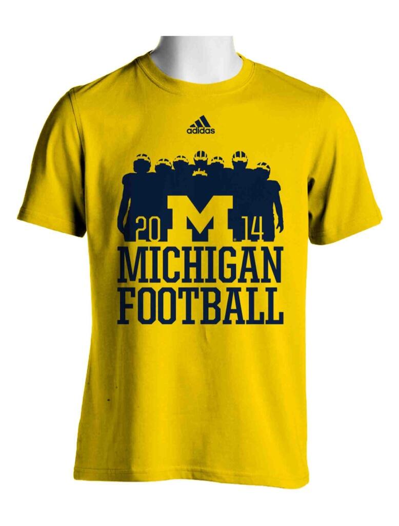
on the front of the shirt above the block M?
When I read this comment then scrolled back up and looked closely at the short guy I literally laughed out loud in the middle of class. Hilarious
Better than in years past, but...
That quote... It's the worst part (grammatically) of the Bo speech. 80% of me believes he mispoke. My grammar nazi side will find it very difficult to wear that shirt.
And I would have liked if they didn't put Bo's name on it. Add a little mystique to it and we all know it's Bo anyway. Though, then if you don't know it's a quote the sentence looks even worse, so I guess you need the citation.
But you, MGoBender, HAVE to rep Michigan with the latest, trendy Wolverine threads.
Bo even makes grammar succumb to his will. Just keep pounding it up the middle!
It's the worst part (grammatically) of the Bo speech. 80% of me believes he mispoke. My grammar nazi side will find it very difficult to wear that shirt.
It's not the most elegantly-phrased sentence, but I don't think it's grammatically incorrect (and I am also a stickler for grammar).
Yep, looks fine.
When/where can I order a few of these? I like it.
MDen.
They usually go on sale in mid-summer.
student prices skyrocketing and for what? That schedule is shit.
I have to assume that's Norfleet standing in front of our O-Line on the front. I appreciate the quote on the back, even if it is a bit awkward.
GO BLUE!
I like the front a lot (as has been said, one of the best in a while), but not the back quote. Why do these always need to be double-sided? I own plenty of shirts with just 1 cool thing on the front.
wonder why...
Is actually pretty good. Smartly kept the schedule off. No reminders given... I'll grab one.
The 06 shirt still sets the standard
The Go Blue, Wear Maize one? That was also my favorite.
Best by a mile
Plus, huge bounceback from the God-awful blue ones from the year before...
I like my All In shirt from 2010 but that season was not as enjoyable.
Nah, 2003 was the best.
August 21st, 2014 at 4:48 PM ^
I hace to concur - 2003 is the Maze Standard when it comes to undergrad ware.
Go Blue
Don't hate on the 3-stripes A logo. It's not bad considering Adidas bought it for only 1,600 Euros and 2 bottles of whiskey.
BTW, that's a fact - http://en.wikipedia.org/wiki/Three_stripes
I don't understand the short guy's helmet in the front center
I mean, Vincent Smith is gone...
My first thought was I support any shirt with Dennis Norfleet in the front and center.
They look good. Nice gesture in avoiding the schedule on the back. I'll snag one, what's another $15-20 bucks (as PSD & tix money has already been spent).
...but really like everything else.
I'll buy.
Glad it doesn't have any "Team 13_" stuff.
April 15th, 2014 at 10:46 AM ^