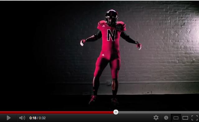
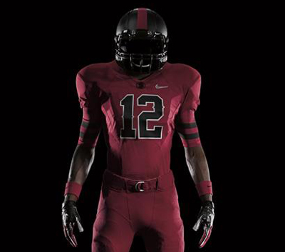
2012 Nebraska "UNRIVALED" TECHFIT Uniform

Nebraska will be wearing these against Wisconsin this year on Sept 29th.
Good thing they will be wearing these, that was one of the most difficult games to watch last year with all the red and white.
http://www.youtube.com/watch?v=tI_TI23HcoM&feature=youtu.be
Love these. Hated Northwestern's, but these are sharp.
They shouldnt wear all red. Its WAY too much. Personally, i think NW's uni's are an upgrade.
Co-sign. The shot at 0:17-0:18 of the vid makes it look like he's wearing a unitard. I mean, what if nature calls in the middle of the game?
would have been better with black pants
My thoughts exactly
These look pretty good. I feel like they took a much different approach to these than they did for Michigan. Something's different behidn the conceptualization with our alternates.
I hate that adidas is apparently going to make it a Thing to have a letter instead of numbers on the front.
I think I actually liked the UTL jerseys, but I know I hated the big Block M on the front in place of the number - made it very difficult to figure out who I was watching at the game when the player was coming my way, and had to base my guess on size/position/etc, rather than just knowing by the number.
I tolerated it, inasmuch as there are damn few historical changes to play with in terms of Michigan's uniform history. You basically have to dig back into the pre-number era for anything.
It is rotten, and stupid, to keep repeating it. Not a precedent that I am fond of associating with Michigan as some sort of pioneer.
Nebraska had a very cool little history with "black shirts." They could have done black jerseys which would have set themselves off very nicely from Wisconsin's regular road uni's. Better than these things.
Wisconsin is another adidas school; are they dolling up their road uniforms for the Nebraska game in Lincoln?
There is nothing significant about a black N on the front of their jerseys...Adidas should've left that for the UTL jerseys only. It was cool when we did it. It wouldn't be if we did it again, and it's not cool when Nebraska is doing it.
Aren't they the 'black shirts?" Why not play off that with black...shirts (tops).
Don't like the big N on the front. Throws off the Qi. Like NW's better. Gotta have the numbers.
I'm actually a big fan of the new NW unis. A night and day upgrade if you ask me. They are doing something with what they got instead of looking like clowns. Before this year it was a debate over worst big ten uniform and NW and Minn were up there.
but as far as my taste goes, I think it was the wrong way to create separation for NW - now I think they look like clowns.
NW's new look is actually reminiscent of those god-awful uni's the Chicago White Sox briefly had in the early 80's (NOT the "shorts" version, though, from the 70's - now THOSE were the worst)
These sort of look like the UTL jerseys. Not the same, but the same general idea.
It sort of seems like Addidas is recycling concepts.
Definitely remind me of our UTL jerseys. I know it's the "new thing" in college football, but this just looks like a red jumpsuit. I'm not a fan. Maybe if the pants and jersey were different colors?
The 'N' on the front kind of looks like it's WordArt
Also, Nebraska is now Texas Tech
They had to add black (or grey) for the wisconsin game. They wear almost the same uniforms with the same colors. I think these are a decent alternte.
Actually we're the away team. See http://www.rolltide.com/sports/m-footbl/spec-rel/052212aaa.html
He meant the Dallas Cowboys
You say it like it's a bad thing.
I'm a fan. Completely worthless comment by me, but hey, at least now you all know how Kevbo feels.
 Idk, this just looks too much like a one-sie to me with the red pants. And is it just me, or is this music that Adidas is using for these hype-videos incredibly corny and not "hype" worthy at all?
It also looks like he has a giant hard-on...
used tampon
Stanfordy
Are you a Catholic Schoolgirl?
He's going to a Dr. Seuss convention
They were pretty unique and showed you could successfully receive a waiver on the NCAA code on uniform regulations.
A little surprised it happened this fast though.
Looks like Domino's Noid
Personally, I like Northwestern's new uniform incorporating their history of innovating the "Northwestern stripe" to sports uniforms.
WOW the unitard look is not something you expect to see when talking about football unis. These are terrible, NW are an upgrade, and Michigan's are growing on me.
Also, query: to all those who hate Nike due to "Pro Combat" madness, is this not exactly the same thing from Adidas? ("Tech Fit" madness, woo!). At least with Nike we'd have better quality fan apparel.
N on the front is lame, and WAY too much red. Way too much.
I sure would like to see the options the seniors were given...both for the Sugar Bowl and for the game vs Bama.
DISLIKE. Their uniform would look better if it was maize and blue and they had winged helmets. To be more clear, I would like Nebraska better if they were Michigan.
In my opinion, Northwestern's are better still. I don't like the "N" with the number on the should, and while I like this shade of red and the black together, there is something about this that makes me wonder if the designer was a fan of the uniforms from the first two seasons of "Star Trek: The Next Generation" for some reason - the spandex unitard is not a football look.