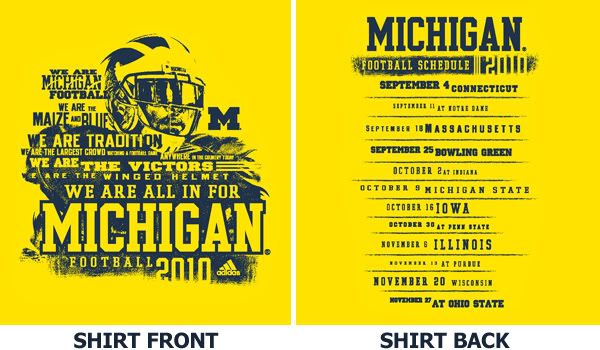
2010 Student T-shirt
Shirt is certainly an improvement over last year. Never again should there be a pledge.
I like the shirt, but it seems like they kind of just crammed all the phrases to superimpose it over the player. I think it would be better with maybe just a few phrases and make the player bigger so it does not look so crammed. But overall, I like it!
yeah, the pledge was a little cult-like. Although I am "all in," to use the parlance of our times, I was a little weirded out by it. Because of the pledge, I will only wear the 2009 shirt once/ week.
"Only" once a week? How often would you have worn it otherwise?
You're like a month late with this.
I didn't see this post the first time so thanks for showing it.
Hopefully I get accepted this month to Michigan so I can wear the shirt in the student section the way it should be worn. It's definitely a fresh new feel to the shirts. This goes along with the direction the program seems to be moving in. It might be a little busy, but I'll be proud to wear it. Didn't get one last year, but I will be getting this as soon as the U of M accepts me in a few weeks.
Going on a tangent here, but it is extremely annoying that I have to wait so freakin long to find out if I'm accepted. What's the point of the early response if I don't get an actual decision untill april? My brother was in the same boat two years ago, and had to decide if he wanted to go about 5 days before the deadline. Ok, rant is over.
Best of luck to you. I also did early response and I was freaking out in December when i hadn't heard back yet and all of my friends had been accepted, so I can see how stressful it must be to not have a response at this point. I hope you get some good news soon.
I hope you get in. But if you don't...
Then don't give up. Just double your efforts and transfer in after your freshman or sophomore year. Two friends of mine did that. They both had great experiences at U-M.
Good luck!
Thanks for the encouragement. I definitely have that set up as a backup and I'm signed up at GVSU already just incase I don't get accepted. I'll definitely attempt the transfer route if needed.
I think the front of the shirt looks sweet honestly, can't wait to get one.
I like that it has an actual player (Woodson?) instead of just generic logos. A winged helmet is nice, but I think the art is cooler when it's real. The style of the front is really cool, I think. It's like graffiti art, and pretty awesome.
Shoot! I needed to post again so I didn't sit on 666 MGoPoints.
Since I've posted this, you guys will probably neg/pos-bang me so I stay at 666. Thanks in advance.
You can buy this if you're not a student right?
April 10th, 2010 at 10:27 PM ^
Yes. Its $15 from MGoBlueShop and will be available in the fall.


