Mock Away Uniforms, Throwback and Otherwise
Alright... so some of you may or may not have been part of the discussion this weekend concerning the possibility of an away jersey re-design. Since Carr had already made the order long before RichRod was hired, he had no control... and in light of the abysmal season, the conversation was that he might want to revamp the away shirts. It then became an even bigger discussion about maize jerseys, blue pants, and white on white uniforms for the maize-and-blue (that sentence alone speaks volumes).
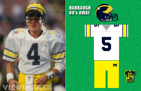
Of course, it was at that point that I went all Jerry Maguire and tore into a mission statement-esque rant about how we must adhere to tradition. At the end of my post (go into my recent blog entries if you missed it), I suggested that we go back to the Harbaugh 80's rendition of the away jersey, featuring one-color numbers and contrasting Northwestern stripes. For those not familiar with the term, NW striping refers to the pattern of thin-thick-thin originally worn by the Wildcats in the 50's, and most of you if you wore socks in the 80's. Here it is:


February 10th, 2009 at 11:37 AM ^
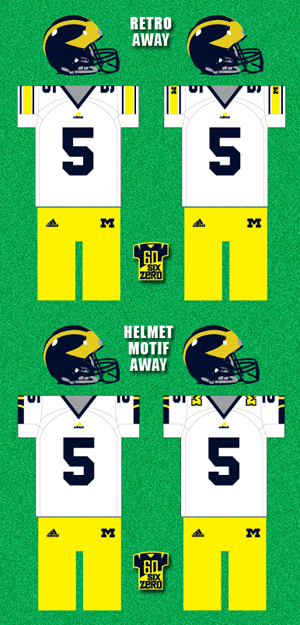
Good work. I agree w/ the single color numbers. I also like the throwback idea. Simplicity implies tradition and class. I think all the modern flashy jersey's look like crap (even in basketball I am glad we have stayed w/ a more traditional jersey). With the throwbacks I like them either w/ or w/o the block M on the sleeve. On the helmet motif ones I do not like the block M on the shoulder.
Does anyone think the basketball team should bring back the large block M on the shorts? I love the jerseys and I think Adidas has improved the jerseys from what Nike did w/ them but I would love to see the M pumped up a bit bigger to Fab 5 size. Maybe w/ a few more wins and a tourney bid we can have the swagger to go back to it.
August 12th, 2009 at 3:15 PM ^
Agree - the larger M was cooler.
February 10th, 2009 at 11:53 AM ^
I'm right with you on the basketball uniforms, I love them but I wish the M on the shorts were bigger. It's almost like we're ashamed of it down there, so it's small and non-threatening (yes, that's what she said.) The M being on the wrong side of the collar is a little weird too. That being said, I am SO glad Michigan has yet to adopt those skin-tight jerseys with the massive skirts...er....shorts. Especially when taken to extremes by teams like tOSU, man do they look stupid (about the only dig we can get on them this year...sigh) Of course now that we've had a little success we'll probably have it too next year.
February 10th, 2009 at 11:54 AM ^
I like the Harbaugh sleeves... it is just that they look so strange when applied to the short linesman sleeves. Still a lot better than most anything else. Any reason for the yellow three-stripe mark? I doubt adidas would let their beloved logo fade for lack of contrast like that.
As for your design, I dig it. No M on the shoulders, though - that is where the roses go.
February 10th, 2009 at 11:59 AM ^
I do like to more "retro" away jerseys although I'd say to tweak it a little so there isn't a white space between the blue and "maize" stripe, and maybe make the maize stripe a little thinner.
I'd say no to the block M. I think the best jerseys are the ones that are the least cluttered with stuff and M should have as simple and "classic" of a design for the road jerseys as they do for the home ones...kind of like how Penn State's jerseys are very no-frills.
I think it's a shame how the Athletic Department has been bullied around a bit recently by the shoe companies to add in some of the odd looking piping just to probably try and sell a few more jerseys because they're different.
As for basketball...remember those awful late 90s jerseys with just the block M on the front. Thank you, Nike ;-) -- http://pilecki.homestead.com/Lavell_Blanchard_2.jpg
EDIT: Why not send the consensus best designs to Bill Martin and athletics? It probably wouldn't do any good, but at least we can co-sign that what we've had lately was not that great.
August 12th, 2009 at 3:36 PM ^
Those Ellerbe-era uniforms were an absolute monstrosity. We had the best basketball uniforms in the country and jettisoned them for those things. Nike's designers are just awful sometimes.
February 10th, 2009 at 12:24 PM ^
I am all for the traditions that make up Michigan football. But I think an alternate road jersey would be kind of cool. Maybe a Maize jersey with Blue numbers worn with the Maize pants. If they were to do this I think they should only pull them out for One big time road game a year though. I know it sounds to crazy for some people but I for one think it would be cool and could maybe become a good luck charm of some sort. Can you imagine Michigan going into Happy Valley and comming out in all Maize and beating the Nittany Lions by 2 TD's. Now that would be sweet!!
February 10th, 2009 at 12:38 PM ^
Or you could look stupid like ND and lose in the green jerseys. Have you not seen WV or Minnesota go all yellow? It has been done, it is played out and mostly it is HIDEOUS! There is nothing intimidating about all Maize. I can see all Navy blue being intimidating w/ the only color being the numbers and the winged helmet but we are getting away from what makes Michigan different.
February 10th, 2009 at 1:40 PM ^
Not really, but I can imagine them going into Happy Valley and coming out in white jerseys with maize pants and beating the Nittany Lions by 2 TDs. Honestly, that looks better to me.
February 10th, 2009 at 4:16 PM ^
I would say that this is among the stupidest rules in college football, but, sadly, it doesn't even come close. This is more indicative of the stupidity of the NCAA rulebook then anything though. However, something to consider even though this is just for fun:
"Players of opposing teams shall wear jerseys of contrasting
colors, and the visiting team shall wear white jerseys. White jerseys may be worn by the home team when the teams have agreed before the season. Players of a team shall wear jerseys of the same color and design."
www.ncaapublications.com/Uploads/PDF/Football_Rulesadc982b5-03fb-4e27-8…
You may remember this from last year's earlier USC-UCLA game.
That said, I personally think that an away maize jersey would be awesome.
February 10th, 2009 at 12:43 PM ^
I prefer the two you made without the block Ms (I've always liked when our only M appears very small on our pants). I think the helmet motif is a better design, but I like the history behind the throwbacks. You should send these in to the AD, not that it'll do anything, but maybe it'll get his mind working.
The single color number is the most important thing, to me at least, for reasons stated many times but most importantly because it resembles the simplicity of our home unis.
Hopefully soon, though, the NCAA will drop the white-away rule and we'll be able to wear the blue jerseys more often... or at least for Ohio State.
February 10th, 2009 at 1:07 PM ^
How about clear uniforms. Its never been done. Talk about gnarly!
February 10th, 2009 at 1:09 PM ^
transparent program.
February 10th, 2009 at 1:47 PM ^
I'm not a fan of NW stripes, especially since the uniforms are now tailored so short that there is hardly any sleeve left. What OSU has now looks stupid because the stripes only go halfway around the shoulder.
I like what we have now, save for the stupid maize apron piping on the front and sides. I really like the blue contrasting color neck and arm holes, as well as the two-color numbers. I don't think it's necessary to put anything on the sleeves except for TV numbers. Stripes or a block M would just clutter that space, which, as benjahen said, is where the roses go.
February 10th, 2009 at 1:59 PM ^
I also love the one color blue numbers. It just plain looks better in every way.
Did you ever consider putting the stylized helmet design logo (the one that has the wing from the side, then 2 stripes, the top one fading away at about 11 o'clock that was on the student shirt in 2003 or 2004) on the sleeves or shoulders? That is new and looks pretty sweet. It might freshen the away jersey look while still being a nod to the most distinctive part of the uniform.
February 10th, 2009 at 3:23 PM ^
What ever happened to the alternate logo you were making. Did you ever finish that?
February 10th, 2009 at 6:49 PM ^
Ah yes, the alternate logo... kinda put that on the back burner. On top of the day job I try not to do too many unpaid side projects at any given time, and some other ones turned up near the end of the season. Actually was part of a logo design contest in the fall, but it's still ongoing. If anyone cares I can post a link.
I'd like to get back to the Wolverine mark at some point. Some people hated the art, many others just hated the idea of an alternate animal mark-- and some were very supportive of the design. It's all good, because I understand most of you love the team as much as I do, so of course you have something to say about it. When I do get back to it, I'll go back and read some of the comments-- I remember somebody saying it oughta be mean as hell-- and maybe start up from scratch.
August 12th, 2009 at 3:39 PM ^
I like the retro aways, although I've never been in love with the sleeves. I like the current sleeves with the solid blue stripe at the bottom. The helmet design could be cool, but I'm not sure - I'd have to see how the sleeve bottom would look over pads.
As for the numbers, I don't mind a thin yellow outline. But what we had from 1997-2004 was definitely too much.

Comments