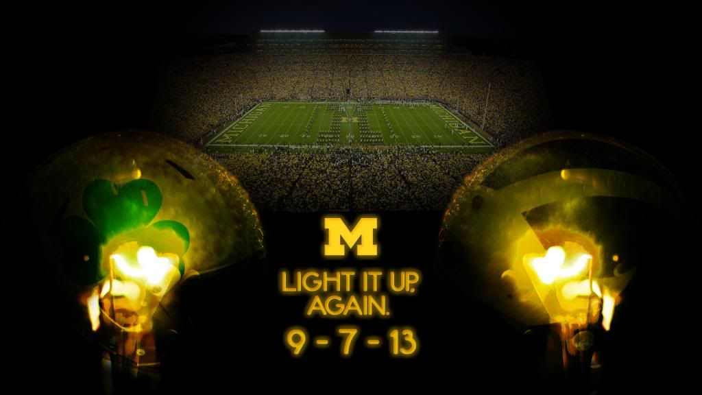
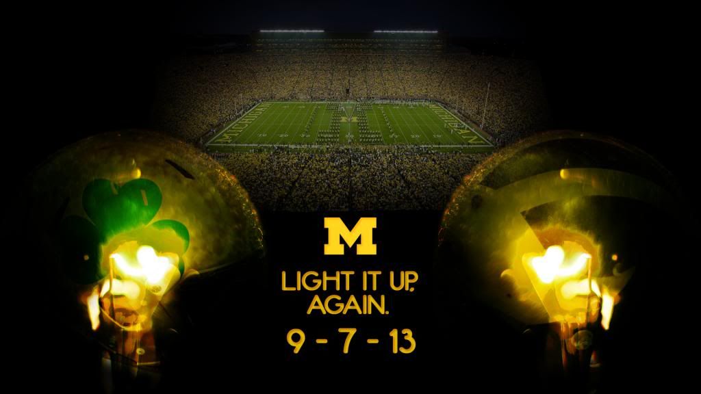
LIGHT IT UP, AGAIN. WALLPAPER

Yes. I realize that it is still May.
Yes. May is still somewhat far from September.
Yes. I am a bit psychotic for working on wallpapers for the upcoming season so...early.
Yes. I'm expecting my second child in July and will most likely lose all free-time and sleep I currently enjoy.
That being said, I am really excited about this year's Under the Lights game and all the wonderful wallpaper ideas I have for this year's edition. Because of "Yes" #4, I am trying to get as much work done early as I can. Naturally, I will have to do some work DURING the season, but I'm hopeful I'll be AT the ND game this year, and thus will not have time for my normal insomniac-like last-minute wallpaper post. So there you have it - my full justification for posting this wallpaper now.
Actually, this wallpaper was intended as more of a "poster" feel. You could slide an Adidas logo quite nicely onto it, IMHO, and it could pass for part of their promotional material. I liked the idea, even if it is predictable, and I think it turned out pretty well. Let me know what you think. The next UTL2 wallpaper I work on will most likely feature a chicken. Just sayin'.
Anyway, I hope you enjoy it. As always, a mobile version will follow within the next few days.
EDIT: Fixed the blocky font. Man, I really need to proof my work more closely.
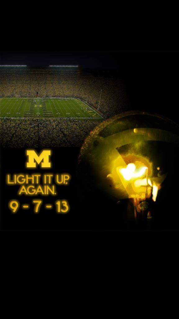
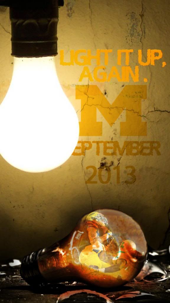
EDIT 2: Added two mobile designs.
Light It Up, Again. (Desktop - 16:9)
Light It Up, Again (iPhone 5 - Mobile)
Light It Up, Again [Broken Edition] (iPhone 5 - Mobile)
- JonValk
Michigan helmet looks chrome. Commence MGoConspiracyTheory/PanicAttack.
Nice work. It replaced the rapture Lewan shot from earlier this year.
Be pleased, not ashamed. September needs to get here faster.
All of a sudden I am pumped up like its almost kick off.......and that wont be for a while sadly.
Nice work!!
I LOVE that slogan -- Light It Up. Again. That SHOULD be the official "tag line" for this game -- and not something lame and uninspired like UTL II.
The flame lighting effect is really cool. Great job on the concept, too, even if you say it's predictable.
EDIT: Unless those are dim lightbulbs, then cool effect still but they sorta look like flames
Incandescent light bulbs!!!! Come on Bro global warming is fo realz.
This may just be me... but is the field slightly askew?
I am not expecting you to do this, but I think a cool picture (for general use) is to lose the Notore Dame related content, zoom in on the field and keep the dark shading on the edges.
Not sure if this is what you meant, but here's something to start with, per request.
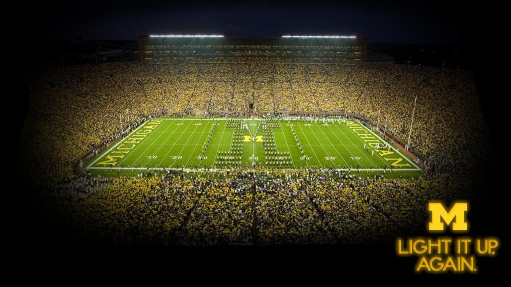
Enjoy!
Excellent work, as always. If you're taking suggestions though, I think the original artwork would look awesome just as it is, just without the outerglow around the text. Like the poster above, I have no expectations for actually seeing this, but thought I'd throw that out there.
I'll try it out and see what it looks like. If I like it, I'll post it in a reply for ya.
EDIT: Nice suggestion. I REALLY liked what I saw when I removed the glow from the text. That's a good critique and the reason I love posting these on here. Here's your reward:
Notre Dame's one and only...fighting chicken. It's a work in progress.

Cool, new desktop background.
Comments