AP Poll Behavior Comparison And "The Hater Index"
Since it is a bye week, I took the opportunity to expand a little on the AP poll analysis that I do and look at how the distribution of the votes we have received to date stacks up against two other teams – in this case, Ohio State and Northwestern. I chose them mainly because they are also consistently ranked so far in the season, but also to see if there was anything meaningful we could extract from the numbers themselves about how teams are treated. So, the question becomes this – is that treatment quantifiable in some weird way beyond the simple fact that it is a poll?
There are two distinct measurements – the actual rank in the poll itself based on the points received and the average position based on the individual ballots. They are different numbers, and I am finding in my first foray into this realm of discussion that they can be different by quite a bit. For example, here is Northwestern’s summary data:
|
TOTAL VOTES |
274 |
|
AVERAGE RANK (ALL VOTES) |
18.942 |
|
MEDIAN |
19 |
|
MODE |
17 |
|
STD. DEV. |
2.744 |
|
VARIANCE |
7.529 |
|
HIGHEST VOTE |
13 |
|
LOWEST VOTE |
25 |
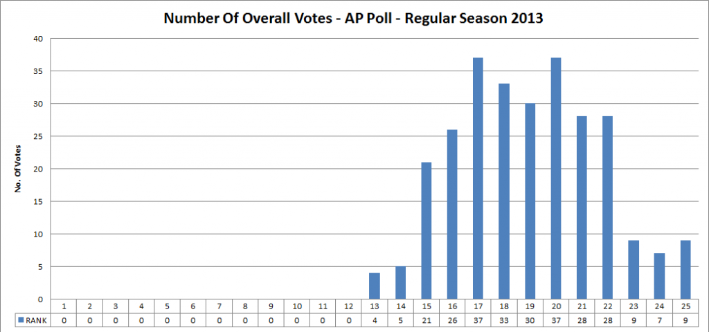
Here is want that looks like in graphic form:
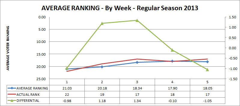
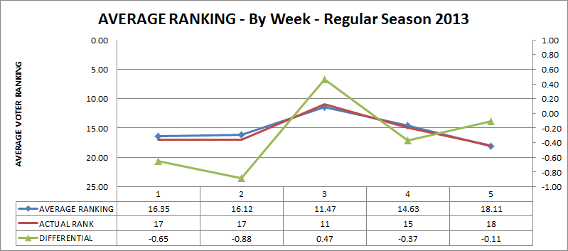
Here is the average rank graphed against the actual rank, but there is an additional statistic here: the differential between average and actual, which I am going to unscientifically term “The Hater Index”.
I suppose that, if I had to define it, "The Hater Index" would be a measure of the overall attitude that the voters express towards a program's performance through their votes.
So, you’ll note here that Northwestern was getting rather a lot of love for two weeks in September with an actual rank that was over one place above the average vote it was getting. I see this as a measure of a few things perhaps, but mostly the positive perception of Northwestern and the trend of its program.
For some contrast, here are the summary statistics for Ohio State:
|
TOTAL VOTES |
300 |
|
AVERAGE RANK (ALL VOTES) |
3.760 |
|
MEDIAN |
3 |
|
MODE |
3 |
|
STD. DEV. |
1.735 |
|
VARIANCE |
3.009 |
|
HIGHEST VOTE |
1 |
|
LOWEST VOTE |
10 |
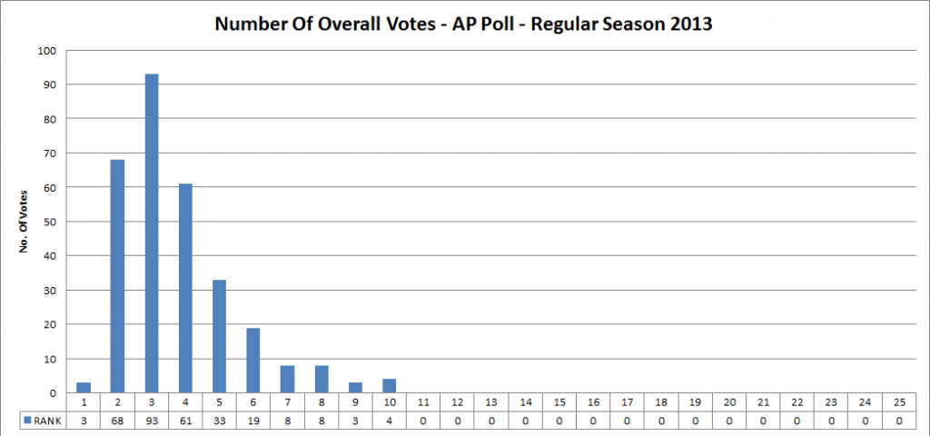
You might see right away that the number of votes is higher than for Northwestern. That’s entirely possible in the AP polling, and perhaps it skews the results for some teams. In any case, you can see how the distribution is fantastically skewed below:
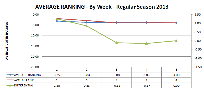
Here is the graph with the differential (average minus actual). Lots of preseason positivity, then a general trailing to “zero” or slightly negative, which I take to be a way of saying that the pollsters might think that Ohio State is on par with expectations somehow. Again, this could be a terrible theory.
At last, here is Michigan’s summary statistics:
|
TOTAL VOTES |
289 |
|
AVERAGE RANK (ALL VOTES) |
15.277 |
|
MEDIAN |
16 |
|
MODE |
16 |
|
STD. DEV. |
3.409 |
|
VARIANCE |
11.619 |
|
HIGHEST VOTE |
3 |
|
LOWEST VOTE |
25 |
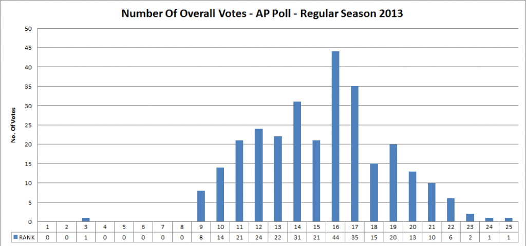
For all we’ve seen in the last month from our team, the distribution of votes somewhat (key word) resembles a normal distribution, albeit you’d have to ignore the left side of the chart mostly.
Michigan’s different is fairly erratic, as you can see – it shows that we didn’t get much credit for CMU, but that people were reasonably high on us after ND. The last two weeks have been negative, but only slightly so after UConn.
TL;DR CONCLUSION:
Again, this is not at all meant to be a scientific measure of attitude, but I do find the fluctuations versus game results to be interesting. One thing I should have done perhaps is use a team with a loss, but that will definitely be part of another iteration of this.
In any event, suggestions for renfinement are always welcome.
September 27th, 2013 at 12:28 PM ^
Guessing CMU - but I like the theory!

September 27th, 2013 at 1:04 PM ^
Fixed the error, although in retrospect it did make the whole thing a little more interesting.
September 27th, 2013 at 12:30 PM ^
Here is the least scientific remark yet: I attended Western Michigan vs Northwestern and had a great seat near the field. Northwestern did not look particularly good. They seem like they can justify the upper end of the Top 25 if they beat some Big 10 teams, but they are far from cracking the top teams in the country. The media seems to be stroking them a bit too much. I think that's the Fitz Effect.
September 27th, 2013 at 7:12 PM ^
September 27th, 2013 at 7:12 PM ^

Comments