Visualizing The Hennechart Comment Count

Swayze Howell Sheen

Editors note: bumped from the diaries for research, interesting-ness, and cool graphs. Republished to get the images the right size. Original here for those who'd like to see the comments on it.

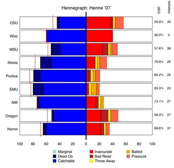
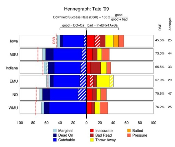
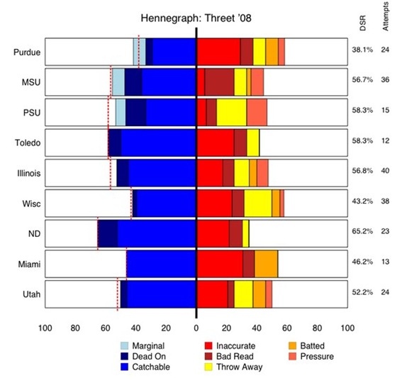
Some days ago, I made a first attempt at visualizing some of Brian's famous Hennecharts. After some feedback (thanks all) and some links to old data (thanks Misopogon), I now try again. Here are "Hennegraphs" for Tate so far this year, Threet from '08, and Henne from '07.

Tate so far this year:
tate09
[Note: the hashed areas are passes I separated out as screens, which is new this year.]

Threet '08:
threet08 
and Henne '07:

henne07

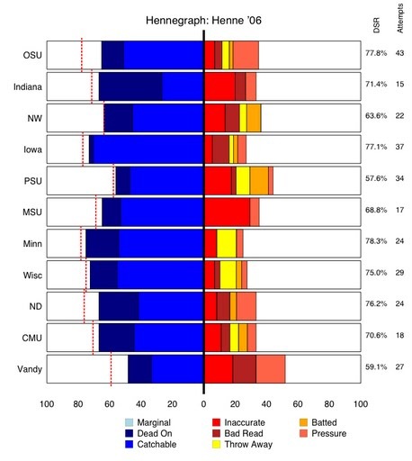
And finally, Henne in the near-championship year '06:
henne06

Some explanations: I took Brian's suggestion to center at 0, pushing "good" events to the left, and "bad" events to the right. Slight adjustment: I moved "Marginal" all the way to the left (it is neither good or bad, but made slightly more sense on the left instead of centered in the middle, as we will see in below).

Recall also that bars that are not fully colored in represent screen passes (which Brian has started accounting for lately).

Also on the Hennegraph: Brian's metric of effectiveness, the Downfield Success Rating (DSR). The Tate '09 graph shows how this is calculated: DSR is the number of (Dead On + Catchable) throws divided by everything else except for Marginal and Pressure. Thus, it is the left blue part (ignoring marginal all the way on the left) divided by the blue part + right red/orange/yellow (ignoring pressure all the way on the right).

I also present the DSR percentage on the right of each bar, as well as the total number of attempts, and graphically depict the DSR number on the left in a dotted red line.

Putting all of this together made me realize the simple genius of what Brian is doing here. Instead of judging a QB by a simple number such as "percentage of passes completed" or some odd QB rating, he is simply analyzing each throw and qualitatively judging them in isolation of whether they were caught or not. Thus, DSR is an excellent replacement for "Completion Percentage" if you are just interested in measuring how well a QB is throwing the ball.

Hope you enjoy. As always, comments are welcome, and thanks to Brian (and Misopogon!) for the grading and the data; any errors, of course, in the Hennegraphs above are mine.

[Notes from me: You can see just on the charts how far the passing game has come from the "good" half of last year, and how far from a healthy Chad Henne—ie, 2006—it still is. And how awful it was for Michigan to suffer Henne's loss in '07.]

Comments

TESOE

October 20th, 2009 at 2:27 PM ^

I know it would be hard to read for small samples, but attempts should not be normalized (or better we should see both.) A 5 attempt Wisc game comparison to the 32 attempt OSU game for Henne '07 says there is more to that story than the Hennechart. You really see the Iowa drop off for Tate. PSU is going to be much better IMO.

Cosmic Blue

October 20th, 2009 at 2:32 PM ^

Not sure if this was brought up in the original diary, but this graph could be improved with a 90 degree rotation. That would put it more like a standard bar graph. It's easier for peoples eyes to decipher relative heights as opposed to deviations from center. other than that, great work. graphs really help to send a message home more clearly, and i think you've done that

UMaD

October 20th, 2009 at 2:38 PM ^

I'd suggest moving Throw Aways to the far left of the bad category (as the color coding implies). If this is a QB metric, a throw away is often a good decision based on lock-down coverage - a sign of maturity and solid decision making. If its a Passing Offense metric, well then, its a bad thing obviously. For a QB evaluation it should be treated somewhat like Marginal - neither good nor bad. Maybe even center it at 0. You could make a similar argument for moving Pressure or even Batted, but theres nothing good there from the QB's perspective, whereas TAs might be/probably are a good thing. Also, a request for an aggregated chart for each of the last few seasons. This would be cool as well.

Ryan

October 20th, 2009 at 2:39 PM ^

Could we also re-render the '06 Henne chart so it's of the same scale as the rest of the charts? Although the bars are proportionally correct, the smaller sized bars make it easier to misinterpret the chart.

blue in ak

October 20th, 2009 at 2:58 PM ^

I was reading a piece from the Ann Arbor News recently and I was struck by the thought, "Wow, this author is an idiot." And then I thought about all of the awesome and in-depth coverage by blogs like MGoBlog. This site just has to be advancing the general state of sports journalism and probably journalism in general. On the above chart, wow. Brian's original Hennechart was a remarkable advancement, but this further chartified incarnation is amazing. I don't know where this skill set comes from, but it is flabbergastingly impressive. You guys rock. I can't wait until you are the mainstream and we can go to a site like the Ann Arbor News and get real news and analysis.

slashgnr76

October 20th, 2009 at 3:00 PM ^

Interesting charts, however, it's a bit hard to distinguish the blues from each other. Changing one of those colors a bit would make the charts easier to read.

just Josh

October 20th, 2009 at 3:11 PM ^

This is fantastic. I know Brian is fond of charts, but it really is amazing how much easier it is to digest data when it is visualized in a graph. I particularly like having each game stacked on top of the previous so that differences are more readily appreciated.

Seth

October 20th, 2009 at 3:13 PM ^

You're welcome for all the thanx! I still wish we could change the "TA" stat to "RA" , "RA+" , and "TA" to account for scrambles that get good yardage. It seems unfair that Tate's big chunk of yellow counts against him, when a "TA" from him gets the same exact result as a 7-yard CA from Henne.

Slinginsam

October 20th, 2009 at 3:21 PM ^

This is excellent. Do college coaches use a metric like this each week to grade out their QBs? Also, does anyone have an idea how Terrelle Pryor would grade out on this system? I was in Cleveland this past weekend attending a relative's birthday, and man, is that dude in hot water. The whole state is blaming him for tOSU's troubles. Glad we got Tate. Very good job here. Kudos for the hard work.

MileHighWolverine

October 20th, 2009 at 5:21 PM ^

I think collapsing each chart into one cumulative chart would allow you to place Henne, Threet and Forcier right next to each other and make it much easier to see the differences between the QB's. It will allow us to compare the first 6 games of each QB on 1 chart with a consistent line of sight (vs. having to lower and raise our eyes to compare game performances). Also, agree that throw away should be close to 0, or maybe even removed, as it is generally a smart move on the QB's part.

baorao

October 20th, 2009 at 8:15 PM ^

I am looking at, but it looks like it involved quite a bit of research. so good job. I can't wait until a few weeks from now when I have my Hennechart epiphany and it all makes sense.