State Of The Site

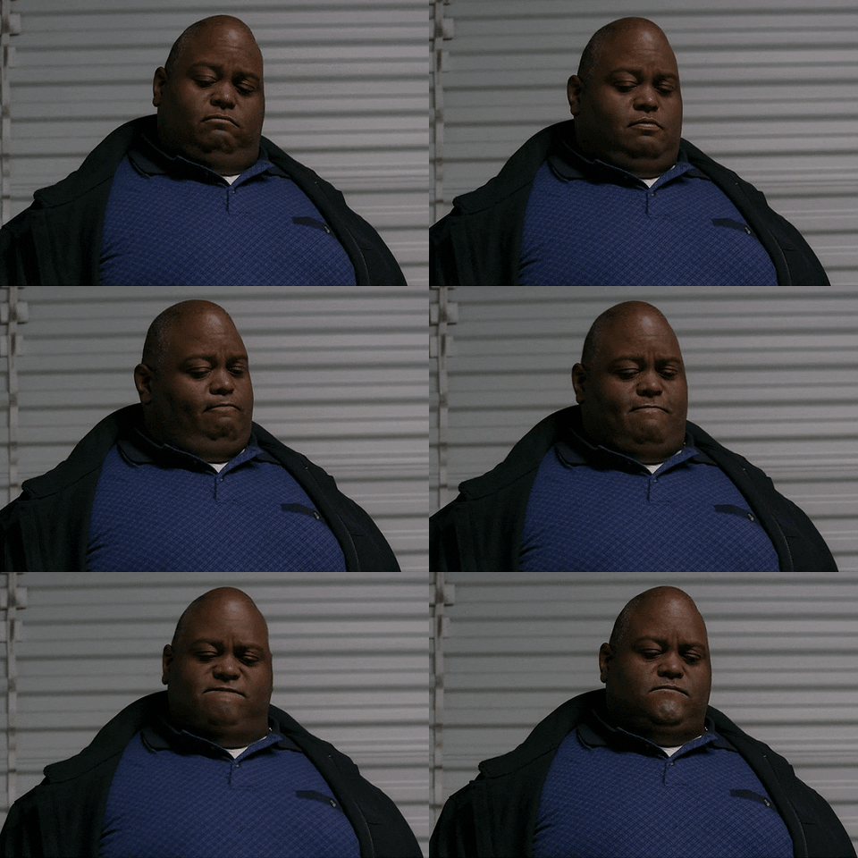
Hey, so you may have noticed that things are slightly busted around here. The site's been in more or less the same state since I cobbled it together some seven years ago, with tweaks here and there and an ever-increasing amount of metal on the back end. This was fine; it's gotten increasingly less fine as time goes on. Let's bring in bolded alter-ego.
Why does your site look like Geocities still?
cumong man
Pets.com?
this was a bad idea
Does Marissa Meyer run this place or what?
Finding good developers turns out to be hard. Twice I've engaged professionals to do a thing, and neither time have the professionals actually managed to do the thing. A revamp of the comment section simply did not work; a planned site overhaul set to launch last summer obviously did not.
I think this is about to change. A few weeks ago I met with a gentleman from Human Element, a local outfit. They're taking over the stalled site revamp. HUEL* has several things going for it. They are local, so keeping in contact is easy. They have 30 people, so they have become good enough at what they do to grow significantly. They're big enough that they've got experience in whatever CMS you would throw at them. Their wifi password is reassuringly nerdy.
For the first time in a while I'm optimistic this will get done and before football season.
*[Referring to them as HE was weirdly religious and quickly discarded. HUEL had much to recommend it.
Internally they go by HEI but you will agree that HUEL is superior morally and ethically.]
But I hate change.
Indeed you do. There will be some changes. The most obvious will be a magazine-style front page. This will require some extra clicking but with the amount of #content on the site, especially during football season, we feel it is required. Not that much else will change, at least at first. The site revamp is a necessary first step before moving forward.
But we can look forward to some new features?
The new design is responsive, which means it'll look good on tablets and phones. It'll be professionally designed, so you'll know that the navigation menu above has useful things that drop down. (Do you know that?) You'll be able to get to the second page of the board without clicking on the mgoboard link above. Points will be exchangeable for Venezuelan bolivars. The site should be much faster and less prone to going down when traffic spikes.
Going forward a continued relationship with HUEL should allow us to implement some larger changes, but let's eat one apple at a time.
What about the app(s)?
Those will also be revamped when the site re-launches. They have to get massively updated anyway since the APIs they ping will change so it'll be a refresh for both. Apologies for the situation with the MGoBlog HD app; I am an Android person and did not know that the standard app had so many problems. Unfortunately the HD app was never authorized and when we were looking for performance improvements before Signing Day it stood out as a big drag.
Please bear with us. That should be fixed when the site re-launches. Your patience will be rewarded. With bolivars, but rewarded all the same.
February 21st, 2017 at 1:54 PM ^
there's a recent study that shows that about 2/3 of software IT projects fail
(http://www.zdnet.com/article/study-68-percent-of-it-projects-fail/)
so, good news: Brian already got the failing two out of the way, and is now onto the third, successful one.
boom! statistics.
February 21st, 2017 at 1:57 PM ^
February 21st, 2017 at 1:58 PM ^
Thank you for the update, Brian. Although I've never thought the desktop version of the site had any problems, I'm looking forward to seeing what HUEL will do with it. As for the app, man oh man I hope that thing can be up and running by football season. We never knew how good we have it with HD until it was gone.
I'm sure some of the changes will take some getting used to, but if the tradeoff is less crashes and more reliability during heavy traffic periods, I'll happily shut my mouth about having to navigate another page or two.
February 21st, 2017 at 2:07 PM ^
All the points.
February 21st, 2017 at 2:15 PM ^
This is welcome news. Good luck with the updates.
February 21st, 2017 at 2:22 PM ^
I like the current site design, but the news of an app revamp makes me happy.
February 21st, 2017 at 2:26 PM ^
This thread should be labelled Meta. To Bolivia with you Seth.
February 21st, 2017 at 2:27 PM ^
Friendly request; let the pro's do their job but please do not let them go overboard with new and edgy design elements.
I'm sure everyone has visited SI.com or MMQB within the past year and a half and their initial revamp was atrocious to navigate. It's gotten better but still needs improvement IMO.
Simply put; people like to consume content from a newest to oldest format. Making them hunt all over the screen to find the Wednesday column is a great way to drive readership to another site.
February 21st, 2017 at 7:20 PM ^
This ^ would be my only (free and worth what you're paying for it) piece of advice. New is great (and being top 5 percentile of age on this site, I'm an outlier for saying it) but magazine-style sites that obscure when content was posted (and updated) are the worst. Being able to clearly see when front page, diary and Board comments were posted is a must. Because, as TIM08 says, people are all like me...they like to consume content newest to oldest!
February 21st, 2017 at 2:33 PM ^
It is great because it is news. It has just been so quiet over the years that it wasn't at all clear if you guys actually were aware of the limitations and didn't care. Or if you were aware, but not fully aware.
As a celebration I am giving +1 to every single comment on this thread. Enjoy!
February 21st, 2017 at 2:45 PM ^
February 21st, 2017 at 2:51 PM ^
appreciate the update, Brian. I think a state of the union, so to speak, was all that anyone ever wanted.
February 21st, 2017 at 2:53 PM ^
Great news...yet, this is the sort of thing that is usually announced before things disappear unannounced when everyone likes said thing and has no idea that said thing is unsanctioned nor a drag on performance. And then announcer of thing going away essentially says, "meh...couldn't make a buck on it, so we killed it...and i shall never speak on said thing ever again."
Looking forward to the revamp. Please say no more Drupal.
February 21st, 2017 at 3:03 PM ^
Cue the, "remember on the old site..." nostalgia. New is the worst.
February 21st, 2017 at 3:04 PM ^
excuse me my fiancee works at Yahoo how dare you
February 21st, 2017 at 3:07 PM ^
I'm sure it has been frustrating for you too, hearing complaints and not being able to get things fixed. Hopefully, the HUEL guys are UM fans!
February 21st, 2017 at 3:08 PM ^
Great news Brian. Really appreciate the site, keep up the great work!
February 21st, 2017 at 3:10 PM ^
I plan to bitch about magazine-style because I loathe magazine-style and I am old and don't like change and hey you damn kids get off my lawn.
But I get enjoyment out of the site so like every other site redesign that inevitably makes things worse -- anyone remember when CNN had a readable website? -- I'll rub some dirt on it and suck it up.
Thanks Brian!
February 21st, 2017 at 3:11 PM ^
I don't think the guys who orignally invented Drupal even use Drupal anymore. It is a very challenging content managment system on which to work. I had a much easier time finding qualified developers to work on our Wordpress sites.
In our social media department we run an auto enthusiast site with around 105,000 members and 4.5 million posts and went through a similar revamp. Members bitched and moaned about the changes but really appreciated the improvements. It only got CRAZY when we messed with their reputation point system (similar to MGoPoints).
My 2 cents - if you mess with the MGoPoints system in any way make sure you keep people informed. I don't really care about the points b/c seriously who cares about points (esp. since i have very few) but members on our car site took a lot of pride in their internet reputation / micro-celebrity. When we messed with the virtual caste system of their pretend world it freaked people out for real.
February 21st, 2017 at 3:25 PM ^
I don't think people really care about points here. I'd argue that most of the high point posters get those points from pos bangs.
February 21st, 2017 at 3:31 PM ^
The more points you have the bigger DB you are... Be it Dave Brandon or douchebag either way you lose...
February 21st, 2017 at 5:05 PM ^
February 21st, 2017 at 3:43 PM ^
Virtual caste system, great description!
February 21st, 2017 at 3:10 PM ^
Frickin' fantastic!
February 21st, 2017 at 3:17 PM ^
You guys have a super site, the best place imaginable for M information and interaction. Thanks for the site updates. Thank you for being you.
Did I mention I had my 3-year join date anniversary about 10 weeks ago?
February 21st, 2017 at 3:25 PM ^
Looking forward to football season even more now!
EDIT: I'd love a negbang feature.
February 21st, 2017 at 3:28 PM ^
improve Big Ten officiating?
No? Oh well, I guess you can't have everything.
February 21st, 2017 at 3:41 PM ^
February 21st, 2017 at 3:49 PM ^
February 21st, 2017 at 3:52 PM ^
I like the way the site looks. It's the old hardware store that looks the same since you were a kid. It's home. All the other sites were bought out by Home Depot and they all look the same now. My only complaint was the error messages whenever we're refreshing for a big commit. (Keep walking Najee Harris.)
February 21st, 2017 at 3:54 PM ^
that this will be labeled syncophantic, but here goes -
I'd be happy to have the site be faster in high load situations, but really - The primary value in mgoblog is not in web design, it's in the well written, knowledgeable, interesting, and occasionally funny (heh) stuff on it. If it didn't change at all, I'd be here, cause I'm getting material here I can't get anywhere else.
It also helps that there are lots of readers that add substantial value. Not clear to me that many would go away if it stayed the same.
Redesigning a successful product is a goal fraught with peril. Proceed carefully, is my (100% unsolicited) advice. That said, thanks for putting the effort in to make it better - Just don't break the good stuff by worrying too much about these relatively peripheral issues. I'll leave to the imagination of the reader how that might happen, but with this musing - I can think of several restaurants that I've loved (especially loved the food), where they decided they "needed" to redo the dining room/sign/parking lot/kitchen etc, borrowed the cash, did the work, and 6 months later they were out of business.
Proceed carefully. Thanks for the excellent site.
Rob
February 21st, 2017 at 3:55 PM ^
Thanks brian. I will be sure to hit the beveled guilt button to aid your efforts.
February 21st, 2017 at 3:57 PM ^
I have always appreciated the site for it's unique layout (and snarky yet high brow crowd). Certainly better than the dredge sites out there. Good Luck on the transition.
February 21st, 2017 at 4:04 PM ^
Best of Luck. Go Blue
February 21st, 2017 at 5:13 PM ^
Thanks for the statement, it's much appreciated.
February 21st, 2017 at 6:22 PM ^
February 21st, 2017 at 7:33 PM ^
February 21st, 2017 at 7:37 PM ^
Like a lot of people said, just want to thank you Brian (have been reading Mgoblog for over a decade), and all the others who provide so much great content (Ace, Seth, TomVH, Aquaman and everyone else).
February 21st, 2017 at 7:41 PM ^
Brian, this is great news. As someone who has worked as a web producer/strategist for most of my career, there are a couple of things that are most essential for a project like this. First, make sure there is a very clear strategy in place and don't assume that you and other stakeholders already know what it is and all agree. Key considerations: What problems are you trying to solve through this effort? Who are key user audiences (internal and external), what are their needs, and which are most important? How will you measure success?
Second: Test, early and often. Hopefully, Human Element integrates user testing into their process and starts that as early as possible. If they are an Agile shop, and who isn't these days, ask them about Agile UX. Get a small group of testers together including your staff and some real site users to provide input, help shape the core site concept, and to test functionality and usability throughout the design and build. Skip this and no matter how great the tech is, the end result may disappoint. I'm sure you'd have no problem getting site users to volunteer their time.
My $.02
February 21st, 2017 at 8:03 PM ^
Love this site.
February 21st, 2017 at 7:48 PM ^
February 21st, 2017 at 7:52 PM ^
I fall into the #change section. I like the old sites' layouts like this one. Much earier to read through, but I also do all of the browsing from my laptop. If it's still in the mix, I would love to see the setup stay as close to the same as possible. But either way, I'll be reading as often as always.
Thanks for all the work you guys put in.
February 21st, 2017 at 9:02 PM ^
February 21st, 2017 at 9:16 PM ^
February 21st, 2017 at 9:27 PM ^
Remember when Adama knew it was all going to s*** so he lied to everyone to keep them calm and told them it was going to be alright and that they were going to Earth, a special place only the military leadership knew about, when in fact he was lying cuz he was making it up, but it just sounded goodnand gave everyone a reason to stop bitching. Only it turns out there WAS (er, is) and Earth and he eventually did get most (i.e. non-killed) of his people there, with some help from angels and robots etc.
Its like that, right?


Comments