Michigan-ND Throwbacks: Possibly Paleozoic

We haven't had a good uniform PANIC for a while, so… yeah… here's… this:

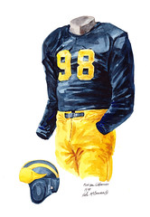
That, according to your favorite newspaper, resembles the "throwback" uniforms Michigan will don this fall. You'll note a few things:
your eyeballs are melting out of your sockets
those uniforms don't look anything like those of the 1960s, which look essentially identical to today's with the exception of the helmets…

…unless they were day-glo orange or something. I think MVictors would have notified us if this was the case by now.
there is a distinct resemblance between these monstrosities and the Big Chill stripey-bucktooth-weasel thing…

…in that both were obviously designed by Joad Cressbeckler. Doctor Saturday pointed me to this image of Michigan's uniforms down the years in which the only vague resemblance between the above and something from history is Michigan's 1891 uniforms.
we must have no taste if the Big Chill jerseys sold well enough for this to seem like a good idea.
Let's hope this a practical joke played on the Free Press as revenge, I guess. Get off my lawn.
This is the sign. The MGoRapture is near!
I don't think that'll be the jersey. Michigan's never worn anything with that many stripes. Below is Matt Patanelli, football capt. 1936, donning a jersey with a Block M and bicep stripes. That's your jersey, IMHO.

is that we do "throwback" jerseys that aren't actually throwback jerseys at all, like when Ohio State wore those stupid military jerseys.
Yeah but at least these look like throwback jerseys. I think if I had a choice between this or a M moderation of the OSU ones, I'd take these. I still hate them, though. And if Brandon announces that these are the jerseys then I think the revolt will be as great as the one when they had the halo, and look what happened to that. If they are truly planning to do this, I don't think they will ever see the light of day.
Can the jerseys be wool sweaters? If so, I'm wholeheartedly in favor.
Under Armor® is coming out with a swank new cardigan this fall.
It's bulletproof, sucks the sweat out of your pores like a steam engine, yet oozes the sophistication required for a weekend in the Hamptons!
I don't actually know if these jerseys were ever worn in a game. It seems to me that they are akin to letter jackets, worn for photos and around campus. This seems evident from the fact recent team capts are pictured in similar "jerseys" for posterity. In any event:
Bob Wiese, Capt.1944

Art Renner, Capt. 1946

Jim Harbaugh, Capt. 1988

And here's David Bass in living color, Capt. 2004

Those sweaters are given to All-Americans who have their picture taken and displayed at the football building.
Is that actually a game jersey or something like a team sweater? It looks a little more "formal" than game day wear.
EDIT: a minute late and $0.50 short - nm
That there's a letterman's sweater, now only used for All-American photos. I've always wondered if they keep a few stock ones sitting around Schembechler for when they have to take one, or if guys actually get one if they're an All-American...
Is that a picture of a player in the letter sweater from the time, or of the jersey from that time??
[There are/were? lots of pictures of lots of guys in the Michigan Union wearing sweaters like that.]
I don't think anybody should be deferring to a double Engineering degree holder for style advice. The Big Chill jersey was awesome, and so are the football throwbacks, though I'd prefer we didn't hop on the throwback bandwagon.
They look like some bs no name brand at Wal-Mart.
<br>
<br>It's hideous.
He or she obivously has different tastes than you. Don't be a troll Bouje, again.
his/her taste is wrong.
The stripes are out of control and the bizarre weasel on the front of the Big Chill jerseys looked absurd.
That is one of the worse drawings of a wolverine ever. A 5 year old could probably draw a better picture. If the tail was thinner it would look like a rat! The big chill uniforms would have looked much better with a big block M, then the poorly drawn wolverine on the front!
The wolverine was the best part of those jerseys.
When he says that engineers can't have style? Excuse me what are his credentials? Fashion design?
<br>
<br>He's also the firs person I've seen to say "wow those look pretty BA".
<br>
<br>In sum wow you commented on my comment to call me out. Shocker.
The Big Chill jersey was neat because it was a one-time thing, and there was a clear antecendent to go back to that had all of the exact same ridiculousness (excepting the day-glo yellow and Arby's patch). If Adidas releases something where they can't show me a picture of a letterman wearing somewhere in the murky past, I will join the crowd en route to AA Torch & Pitchfork.

I like this #85 jersey better. Who else besides Brandon leaks a mock-up with his own number?

hahaha good call
they look like something that my wife would put on a stuffed animal.
Staring at those unis has made me sterile. Alas, poor unborn Moe junior!
@TWoolf29 Hell naw. Lol RT @Trops10: @TWoolf29 Yo man please tell me these arent the ND game jerseys...yfrog.com/gytgwbwj
<br>
<br>
This eases my pain.
Will these uniforms affect the team's performance versus Notre Dame?
No?
Then I don't care. Go Blue.
I wish I could upvote this more.
I took care of that for you. Loaned my upvote to the cause.
It could
That hasn't affected Oregon the past 8 years, and it sure didn't affect Ohio State when it played Michigan in 2009 or 2010.
To be honest I'd rather have anything that they've had.
You would rather not have that. Yup, we get it. Good thing everyone gets their own opinion. jg2112's opinion happens to be different their yours. Get over yourself.
Then I'm sure you'd have no problems if they came out in pink and orange instead of maize and blue.
They could play in polka dots and fleld hockey skirts and I wouldn't give a shit.
I don't even know what to say to this.
<br>
<br>Wow...
<br>
<br>I've got nothing.
Then you're in the minority, I would bet.
We had our normal home and away jerseys but our coach decided that since our team was special and was going to be very good that the school would get us a "special" black uniform. Our school colors were red and white but the black, white and red uniforms were awesome and whenever we'd put them on for big games the team was always very excited and more amped up to be wearing the jerseys.
<br>
<br>We only wore them a few times during the year and every time we wore them we played better than we would have with the normal jerseys.
That just shows your immaturity, a trait you haven't outgrown.
Neither does running onto the field and jumping up to touch the M Banner, so I guess we can dispense with that charming but useless bit of tradition as well.
They look like Maize (New Maize = Bright Yellow) and Blue prison uniforms....terrible.
Sarcasm or not... Kelly's still a morally questionable asshat. And you know this, man.
how a few words typed randomly on a blog can transmit just how smug a person's smile could be as they typed it...
and then I read Irish's post.
Hayden Fry approves!

I like the 1940s vintage unis, which are not too different from the current unis. Main differences, aside from sleeve length, are few (see below). Speaks to the timelessness and consistency of our (home) uniform design.
- no names on back
- no numbers on shoulders
- no logos (duh)
- darker maize

"throwback" should be classic and timeless, not tacky.
The font style is slightly different, as well. You can't see it in the image above, but there was an extra serif that isn't there on the current uniforms.
Below is a picture of the 1947 National Champion Michigan Wolverines. Look at #24, QB Howard Yerges, in the lower-left corner. You can see the extra serif at the top of the #2 and at the top of the #4. In fact, with the extra serif, the #4 actually resembles the right side of a 'Block M.'
For me, this uniform would be the perfect throwback, as this was the team that was awarded the AP National Championship in an unprecedented post-bowl vote, on the strength of their decisive win over USC in the Rose Bowl. The team they unseated? You guessed it. None other than the Notre Dame Fighting Irish.
Comments