Jordan Football Uniforms Unveiled


via Michigan's new apparel site, which also has many detail shots
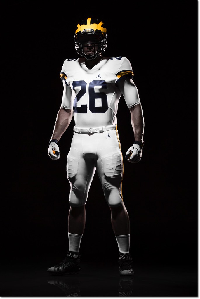
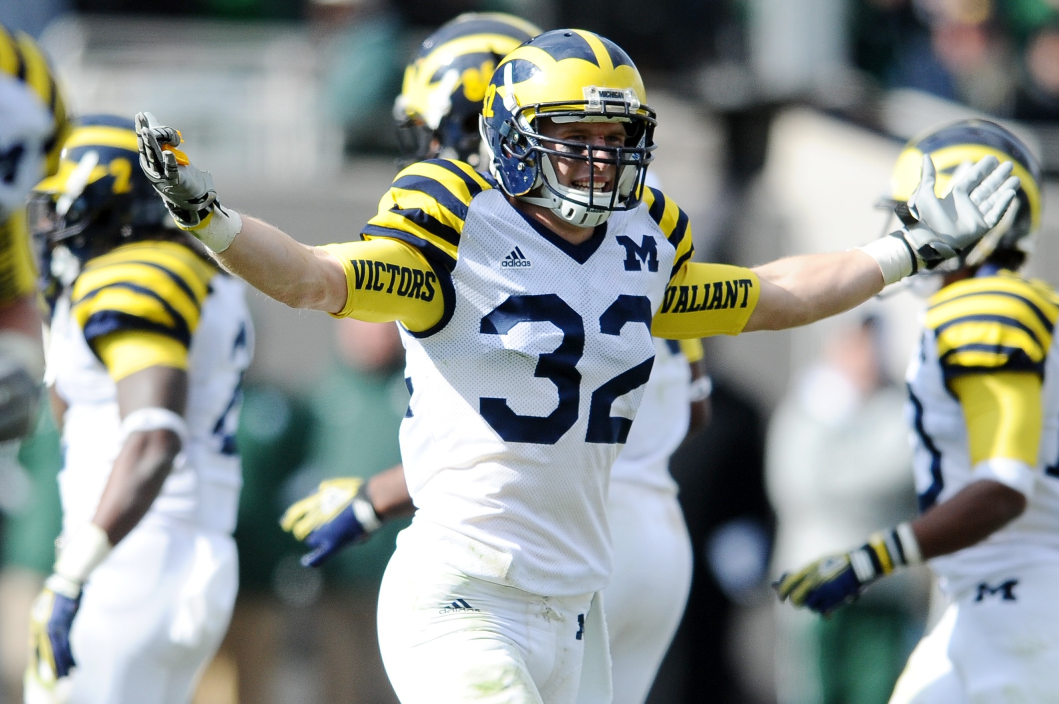
Michigan officially unveiled their new Jordan brand football uniforms in a totally understated setting this afternoon, and for the most part little has changed except the logo. This is good, especially if you're a fan of the all-white road uniforms. I count myself among that number, and so does Jim Harbaugh:
Harbaugh says the white pants on the road will be a permanent thing. He's a fan of that.
— Nick Baumgardner (@nickbaumgardner) August 2, 2016
Nike did make a few minor alterations. The number font is new, which you can see in both the '4' on the home uniform and the '2' on the road. The road uniforms now feature two sleeve stripes (late 80s/mid 90s style) instead of the three they wore last year [edit: my mistake, it's still three stripes—the bottom one was hard to see] and the sleeve numbers have moved from the side to the top of the shoulder. The rest is the same, and mercifully clean, too—I was worried the Jumpman logo would be too large, and that's not at all the case.
There is one major change, and it's to the most legendary aspect of the uniform:
Those are matte helmets. Michigan spokesman says the plan is to wear those this season. That's new. pic.twitter.com/5taVBAjmWs
— Nick Baumgardner (@nickbaumgardner) August 2, 2016
I'm ambivalent about the paint style of the helmet, but I might be in the minority there.
I'll hold off on diving into color analysis—at first glance, both the maize and blue look a little darker than past years—until we get some photos in normal lighting.
August 2nd, 2016 at 11:43 PM ^
Sent from MGoBlog HD for iPhone & iPad
August 2nd, 2016 at 10:43 PM ^
I have to rationalize it like that because I friggin hate MJ to the end. Respect his accomplishments and put him among the greats but he is my nemesis in my NBA fandom. Always rooted against him and will never forgive him his dream team BS that kept Zeke off.
The logo itself is cool to me visually and I think it will be a huge branding success. I'm glad M is out in front and I think will reap the fortunes that come with it. Unfortunately so will my nemesis.
Sent from MGoBlog HD for iPhone & iPad
August 2nd, 2016 at 10:54 PM ^
having things get a little bit better every day is a most welcome turn of events.
August 2nd, 2016 at 11:14 PM ^
Here is a better look at the helmet in natural light:
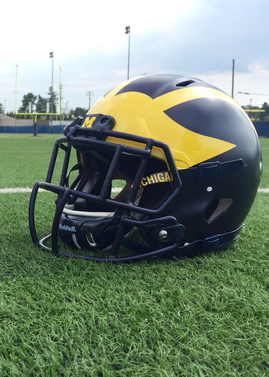
Looks pretty good. The blue is not too matte, and the maize is not too orangy.
August 3rd, 2016 at 10:29 AM ^
Sent from MGoBlog HD for iPhone & iPad
This might make sense if Michigan had a Block M on their uniform last year... or ever.
August 3rd, 2016 at 10:32 AM ^
August 3rd, 2016 at 12:15 PM ^
Can you post more?
(While you're at it, try to realize that in your effort to find Waldo, you're missing the big picture as well as the entire point, quizzler.)
August 3rd, 2016 at 12:57 PM ^
in your post responding to Don is that you don't know what you are talking about.
Don's sarcastic post implies that a Block M was taken off the jersey and replaced with the Jordan logo (and jokes that the entire university will follow suit). Last year's uniform didn't have a Block M on it, rendering his post technically incorrect and kind of lame. That's the point. You missed it.
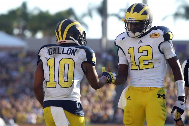
I threw in the "or ever" because if you look at decades of Michigan uniforms, rarely is there a block M on them. Yes, the whites had it on the sleeve for a brief period, it's appeared in select bowls, and it's been prominent on the pants in recent years. But neither Jim Harbaugh, nor Desmond Howard, Charles Woodson, Chad Henne, Denard Robinson, Jake Rudock or hundreds of others that span my lifetime ever wore a blue Michigan jersey with a Block M on it.
The Jordan logo didn't replace the M as Don mistakenly insinuates. It replaced the Adidas logo. In fact, you're more likely over the course of the history of Michigan football to NOT see an M on the uniform at all than you are to see one. And the fact that your petty little fit of "Well, actually" had to rely on 4 alternate uniformz further proves that.
If I say MSU's colors are green and white, are you going to reply "You're wrong! Here's a image of them in 2013 with bronze helmets"? No. That's a one-off and misses the entire point -- just like you have here.
Michigan generally does not have an "M" on the uniform. (Yes, they have before. Congratulations on finding the more-than-obvious exceptions that any 2nd grader could identify by memory. This wasn't a contest, but you tried really hard, so I'll buy you a box of crayons or something.)
The fact remains that the Jordan logo did not replace a Block M anywhere on the uniform from 2015 to 2016. So Don's well-intended humor misses the mark. Get it? That's it.
You, meanwhile, stumbled in here obviously looking for an internet fight. This exchange was unpleasant and I hope to avoid you at all costs in the future. Take care.
This reply is so bad, I don't even know where to begin. You continue to miss the entire premise of the argument. For whatever reason, this whole thing exceeds your pay grade and I'm not sure you'll ever catch up.
- There's no logo on the helmet. It's on the visor tab. Just like Ty Isaac had Adidas logos on his visor tabs last year. The fact that you don't know this confirms that this entire conversation has been an immense waste of my life.
- This has absolutely nothing to do with a university policy on advertising in the stadium. If you want to have some grand philosophical cry session about how capitalism is ruining your country, go do that somewhere else.
- Don't include the jersey. The M has never been on the blue jersey (or, rarely, I should say. Apparently I can't exaggerate for effect or you'll post 72 screen grabs from UTL). If you want to act like an M on the pants is some type of tradition, be my guest. What you've missed from the very beginning is that this is not the fucking point and it does not matter.
- The Jordan logo is not roughly in places where the university logo has been. It's roughly in places where the PREVIOUS MANUFACTURER'S LOGO has been. Having a manufacturer logo on the jersey/pants/shoes/gloves is not a new thing. And anybody who acts like it is (You and Don) and says idiotic things like "We might as well be the University of Jordan!" obviously doesn't pay any attention to uniforms until events like this where you're beaten over the head with uniform related information. Then, through pure exuberance and fandom and a need to participate, throw together half-cooked opinions about how corporations are ruining the entire institution.
It's just a logo. It replaces a different logo that sat on that same jersey and those same pants for 8 f***ing years. Neither replaced a Block M because there wasn't a Block M there to begin with. (I just know you're going to try to tell me the Jumpman is in the same spot on the pants as the M used to be and I'm going to lose what's left of my shit - so just please use your noodle for 2 seconds and understand that the Adidas logo was on the opposite hip and the Jumpman essentially replaces that corporate logo.)
This is the entire point. Read it again.
- Read it again.
- And again.
- Quoting you: "It is odd to me that the logo of a corporation is now more prevalent..."
You see that? Where you used that little three letter word - "now"? That's your problem. And that's Don's problem. And that's what set me off in the first place. This is not "NOW" the case. This has BEEN the case for decades. Jordan is replacing Adidas. Jordan is not replacing Michigan.
If you were paying attention the past 20+ years and noticed that the manufacturer's logo was plastered all over the damned uniform, you wouldn't have this shitty take. However, it's obvious that you don't pay that much attention -- which, har-dee-har-har, makes it f***ing hilarious that you two of all people would try to slap together a "This logo is the death of western civilization!" opinion.
Now, in one of the other threads - I believe the one with the picture of Rashan Gary - a fine poster by the handle "TheyTookOurJobs" points out that everybody is losing their shit and needs to go outside and get some fresh air.
He is absolutely right and this 100% applies to me. This is taking the place of an Airing of Grievances post I would've made in that much-needed thread tomorrow.
I try to stay calm and level-headed but there are some smart people here and they are talking about some of the stupidest shit on earth and I can't handle it. I've got an itchy trigger finger and I've never negged so many people as I have in the last 3 days.
It's just fucking yellow, guys. There is no "True Maize". You're smart people. Act smart.
Yes, it's a basketball player. That's the logo. I have no clue why your brain can't process that, but please shut up about it.
See you all on Monday.
Clever, but I really think the block M has been on the maize pants like forever and has now been replaced with a player not to be named that played for the Bulls that hated Isiah Thomas. I think Adidas tried to put the block M on the back collar like the basketball jerseys but Harbaugh taped over it lol
Comments