Jordan Football Uniforms Unveiled


via Michigan's new apparel site, which also has many detail shots
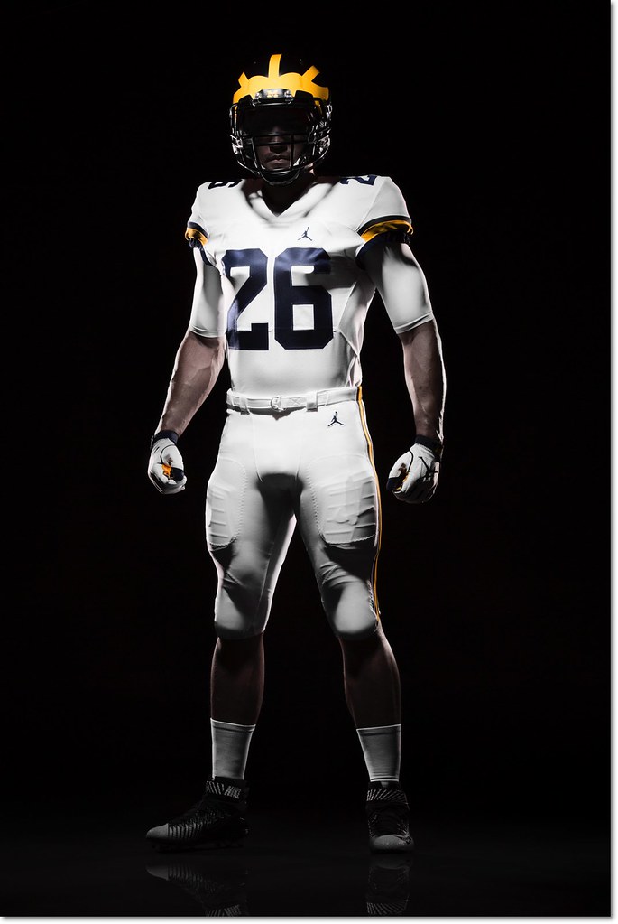
Michigan officially unveiled their new Jordan brand football uniforms in a totally understated setting this afternoon, and for the most part little has changed except the logo. This is good, especially if you're a fan of the all-white road uniforms. I count myself among that number, and so does Jim Harbaugh:
Harbaugh says the white pants on the road will be a permanent thing. He's a fan of that.
— Nick Baumgardner (@nickbaumgardner) August 2, 2016
Nike did make a few minor alterations. The number font is new, which you can see in both the '4' on the home uniform and the '2' on the road. The road uniforms now feature two sleeve stripes (late 80s/mid 90s style) instead of the three they wore last year [edit: my mistake, it's still three stripes—the bottom one was hard to see] and the sleeve numbers have moved from the side to the top of the shoulder. The rest is the same, and mercifully clean, too—I was worried the Jumpman logo would be too large, and that's not at all the case.
There is one major change, and it's to the most legendary aspect of the uniform:
Those are matte helmets. Michigan spokesman says the plan is to wear those this season. That's new. pic.twitter.com/5taVBAjmWs
— Nick Baumgardner (@nickbaumgardner) August 2, 2016
I'm ambivalent about the paint style of the helmet, but I might be in the minority there.
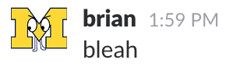
I'll hold off on diving into color analysis—at first glance, both the maize and blue look a little darker than past years—until we get some photos in normal lighting.
I for one love the look of the helmet shining in the sun. Matte helmets? Meh. Nope.
seems like change just to make a change.
Well, it's a jersey so... yea.
It is a little weird though. They don't sell that many replica helmets.
And all you people wjho are against "white pants and matte helmets" will suddenly find them awesome because they'll become synonymous with Harbaugh destroying thine enemies.
pants.
I prefer the maize pants for the road uniforms. And I will prefer maize pants even if M wins it all this year.
But the white pants from 2015 and now 2016 look good too.
And if they are going to do 'all-white' road uniforms, then these are just about as good as one could imagine. Very well done.
The all-whites look good up close, but from a distance / on TV, they look dingy.
Go back and look at the Florida Bowl game UFR videos. Up close the whites look good. But from a distance the thin yellow and blue stripes on white make them look like dirty laundry.
I will continue to hold the general opinion that matte helmets are dull and all-white uniforms are bland. The numbers on the scoreboard won't change that.
Fixed your avatar :)
Nicely done
There's actually some real truth to this. When the Denver Broncos changed to navy blue jerseys with the (now unremarkable, at the time earth-shattering) swooshing orange body stripes it was a huge deal and widely panned. But then the Broncos won two consecutive Super Bowls with them, and that look now means winning. They still have the same design, though they've switched back to orange as the primary.
Winning makes uniform designs. I was leery of the '97 change of the white jersey; I liked it a whole lot better after players wearing that jersey curb-stomped Penn State that year. If we, say, win a couple of key rivalry games and a certain game in Florida wearing those white pants, well, we will all remember them fondly.
The road unis overall, white pants.
Correct maize
Jumpman logo is small
Things I dislike
The new font
The B1G logo and jumpman logo are VERY CLOSE to the numbers. I looks weird. They should be higher.
Matte helmets
No more black cleats
Jumpman logo on pants - should only be on jersey
The new helmet bumper.
Overall they its a net negative for me. They really could've (and should've) taken last year's unis, like the design of them, and Jordanized it - i. e. the higher quality of material Jordan uses as opposed to adidas would've made the unis look MUCH better, while keeping the classic look.
No need to mess with the black shoes, the helmets, or the font. Everyone is acting like there were no changes and there are actually a lot of changes - - little changes, yes, but changes that mess with a classic look in really unnecessary ways.
Sent from MGoBlog HD for iPhone & iPad
This says it all: "...there are actually a lot of changes - - little changes, yes, but changes that mess with a classic look in really unnecessary ways."
Exactly. What was wrong with Woodson's uniform? Nothing. Perfection. No need to tweek.
However, I am still going to have to see the colors in natural light before proclaiming that NIKE got it right.
when people say things like "correct" maize.
Correct as based on what? If the promo pics are accurate at all, this maize is clearly NOT anything close to the maize we were wearing in 1997 (also basicaly the same maize we wore for the 20-30 years before 1997 as well), which was what Nike claimed they were basing it off of.
So what is "correct" maize?
it is really hard to tell what the 2106 Nike 'maize' will look like in natural light
Countless prior threads have debated the 'correct maize' issue.
Long story short: 2015 'maize' was darker and more 'orangy' than the maize Woodson wore in '97 (and used for many years prior and until Adidas).
I would argue that Michigan used a pretty consistent maize hue from the 70s until Adidas showed up. The maize from that period is what I associate with Michigan as the 'correct' maize, not the weird Adidas highlighter hues or the darker 2015 'maize.'
and they will come.
Why on earth do people like pants that make us look more like Penn State?
Bring back Maize pants!
Otherwise looks good though.
Penn State did not invent white pants. But white is one of their colors. Most schools that wear white pants (or an all white look) have white as one of their colors. We don't.
Then again I prefer when OSU wears their gray pants so maybe I just hate white pants. If I was an OSU fan I'd probably wonder why they want to look like Indiana when they go with white pants.
the amount of people that keep bringing up penn state every time white pants are discussed is amaizing. almost every team wears some form of white pants at one time or another. psu has no colors that remind you of michigan, they wear all white and their helmet is a plain all white. so what is so similar?
Sent from MGoBlog HD for iPhone & iPad
After seeing these pics, I feel an instinctual urge to upload myself into my laptop, put on the uniform, and fight Tron in the face.
Maybe the unveiling will inspire Harbaugh to incorporate Tron disc wars in fall camp? Maybe Harbaugh will don a uniform and fight Tron in one of those light cages?
Although if he uploads himself, Harbaugh might be lose himself in an eternal battle against a digital copy of himself...which is 100% my prediction for how he dies...
Clean. Clean. Clean. That's how a uniform should look.
August 2nd, 2016 at 10:51 PM ^
Sent from MGoBlog HD for iPhone & iPad
Sent from MGoBlog HD for iPhone & iPad
Sent from MGoBlog HD for iPhone & iPad
Look what they did to the helmet stickers

You can't even see them on the matte blue background. Outrage.
and I'm amazed how people will watch a game and make a comment about the stripe on a pant looks different now or the shade of maize doesn't seem right. I don't know I usually spend my time actually watching the action and players techniques and stuff like that.
Looking at these they look just like UM home and road uni's from last year, other then bigger numbers. Everyone was so excited about it being Nike. I don't know to me they are all the same, as long as the team plays well I don't really care about the size of the font of the numbers, or a matte helmet or shade of maize on the unforms. Just play good football.
If they ever did a third jeresy though I would like to see all Maize for a big game sometime.
Not the old private golf club policy, but these sweet, sweet unis.
I feel like the Jumpman logo is getting skinny in inverse proportion to MJ getting fat.
I'm not as fond of the all-whites as Harbaugh.
We did not beat Ohio State a single time when Michigan wore the all-whites in the mid-'70s. Not even once. So much for pleasant childhood memories.
Give me the '90s Woodson unis any day.
Sent from MGoBlog HD for iPhone & iPad
Jumpan on a football jersey is weird. Should be the desmond heisman or one of those poses mentioned in a recent post.
"Why is there a basketball guy on a football jersey?"
Sent from MGoBlog HD for iPhone & iPad
A lot of males too.
It's only cool because we in the CFB world all agree it's cool. It's actually kind of dumb.
But 5-star recruits like it. So it's brilliant.
Contrary to his tweet, they don't seem to be matte. Rather, the blue simply isn't high-gloss like it was before. I think it's a nice sheen and fully consistent with the traditional uniform.
White pants look so clean, I love it. Everything looks great. Nike/ Jordan did a great job. September 3rd can't get here soon enough.
The crown of the wing in the front of the helmet is much smaller than it was back in Harbaugh's day:

The helmet stripes were also thicker and much closer together.
That's something that has varied widely over the years, depending on who is painting the helmets and what vents and so forth on the helmet they are trying to paint around.
There has never been one single consistent wing pattern over the years.
August 2nd, 2016 at 10:14 PM ^
August 2nd, 2016 at 10:19 PM ^
August 2nd, 2016 at 10:42 PM ^
Sent from MGoBlog HD for iPhone & iPad
Comments