Jordan Football Uniforms Unveiled


via Michigan's new apparel site, which also has many detail shots
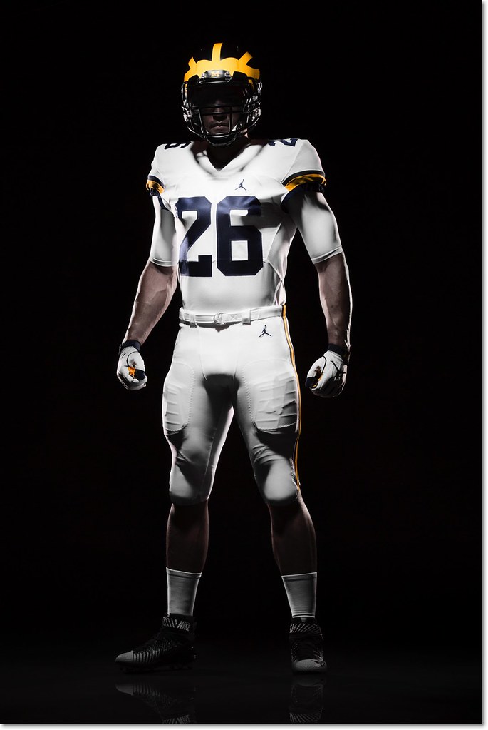
Michigan officially unveiled their new Jordan brand football uniforms in a totally understated setting this afternoon, and for the most part little has changed except the logo. This is good, especially if you're a fan of the all-white road uniforms. I count myself among that number, and so does Jim Harbaugh:
Harbaugh says the white pants on the road will be a permanent thing. He's a fan of that.
— Nick Baumgardner (@nickbaumgardner) August 2, 2016
Nike did make a few minor alterations. The number font is new, which you can see in both the '4' on the home uniform and the '2' on the road. The road uniforms now feature two sleeve stripes (late 80s/mid 90s style) instead of the three they wore last year [edit: my mistake, it's still three stripes—the bottom one was hard to see] and the sleeve numbers have moved from the side to the top of the shoulder. The rest is the same, and mercifully clean, too—I was worried the Jumpman logo would be too large, and that's not at all the case.
There is one major change, and it's to the most legendary aspect of the uniform:
Those are matte helmets. Michigan spokesman says the plan is to wear those this season. That's new. pic.twitter.com/5taVBAjmWs
— Nick Baumgardner (@nickbaumgardner) August 2, 2016
I'm ambivalent about the paint style of the helmet, but I might be in the minority there.
I'll hold off on diving into color analysis—at first glance, both the maize and blue look a little darker than past years—until we get some photos in normal lighting.
Comments