Jordan Football Uniforms Unveiled


via Michigan's new apparel site, which also has many detail shots
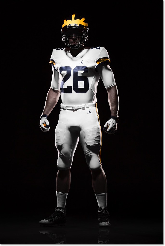
Michigan officially unveiled their new Jordan brand football uniforms in a totally understated setting this afternoon, and for the most part little has changed except the logo. This is good, especially if you're a fan of the all-white road uniforms. I count myself among that number, and so does Jim Harbaugh:
Harbaugh says the white pants on the road will be a permanent thing. He's a fan of that.
— Nick Baumgardner (@nickbaumgardner) August 2, 2016
Nike did make a few minor alterations. The number font is new, which you can see in both the '4' on the home uniform and the '2' on the road. The road uniforms now feature two sleeve stripes (late 80s/mid 90s style) instead of the three they wore last year [edit: my mistake, it's still three stripes—the bottom one was hard to see] and the sleeve numbers have moved from the side to the top of the shoulder. The rest is the same, and mercifully clean, too—I was worried the Jumpman logo would be too large, and that's not at all the case.
There is one major change, and it's to the most legendary aspect of the uniform:
Those are matte helmets. Michigan spokesman says the plan is to wear those this season. That's new. pic.twitter.com/5taVBAjmWs
— Nick Baumgardner (@nickbaumgardner) August 2, 2016
I'm ambivalent about the paint style of the helmet, but I might be in the minority there.
I'll hold off on diving into color analysis—at first glance, both the maize and blue look a little darker than past years—until we get some photos in normal lighting.
On a cloudy day, our unis often look black on TV, not blue. This will make that even worse.
kind of hard to please everyone under every condition possible.
I'm a fan of the uni and cleats. We are gonna kick some ass and look good doing it.
I like it. Helmets look like maize is still glossy and only blue is matte, which looks sharp. I'm not crazy about it as a standard uni for the whole season, but it's not the end of the world. If you're going to add something different for the "cool kids," that's about the least offensive thing they could have done.
The maize is most likely still glossy.
The Michigan helmets are not blue helmets with yellow wings painted on them. They are yellow helmets with the outline around the wings painted blue.
You can really see this when the paint wears off:

It looks like we still have a glossy yellow helmet, they are just going to use a more semi-gloss blue paint for the outline around the wings this season.
The image at the top doesn't match the closeup. For example, where is the B1G logo on the top image?
http://detne.ws/2aKTMSD
What a cool story / thought / idea. Based on this story, the new #4 may be my favorite modification to the jerseys, and I will no longer complain about the font change!
Thank you for sharing!
OK, that's freakin' awesome. Usually I'm ambivalent about Nike's efforts to put all its schools in a unique number font, but this is a really cool reason to do so.
It's a bit of a reach, but OK.
I like...
It all.
Glad that not too much was changed from last year. And really excited to see how the helmets turn out. The only thing I wouldn't mind to have added would have been the block M on the pants.
I really liked the block M on the pants. Reminds me of Woodson and company.

I think Sparty had the same matte look last season. it's not matte matte like Minnesota.
OMG how has nobody commented on the socks???????????????
Super excited that we're going back to the navy socks for the home unis!!!!!!!!!!!!!!!!!!!
/okay, seriously I do like the navy socks at home.
The white away socks with the dark shoes look like Joe Paterno, thus furthering the unfortunate Penn State-ization of the all white away uni.
When we say matte helmets are we talking Outback Bowl style? Because those were trash and wearing them the whole year would actually bother me. But these don't look that bad.
I completely agree. And not because of "Michigan tradition", but because I think all matte-finish helmets look like dull garbage.
(Edit: I haven't heard anyone other than Nick Baumgardner say the helmets are matte. From every picture I've seen, they aren't -- or at least aren't anywhere near what I consider matte.)
They are matte but with a little shine to it. Like the Oregon version of their matte green helmets. The 2013 matte helmets looked pretty dull, these look like they have a little shine to them. They may not be glossy, but they aren't dull either.
They are by no means like the 2013 Outback bowl helmets. These have a little bit of shine to them, but they are certainly not glossy. I think they will look great.

It's a football-wide trend to get us all acclimated for when they go back to leather helmets.
You just wait.
the simplicity of the road jerseys (like last year). I hated all the yellow piping and number outlines on pervious years and am a big fan of the return to simplicty.
I couldn't really put my finger on what I liked about them but now I realize that's it. All the attempts at different piping/outlines never really took. Simple, clean, and understated is perfect.
Sent from MGoBlog HD for iPhone & iPad
Sent from MGoBlog HD for iPhone & iPad
Love the matte helmet. Also love the all white road unis, really emphasizes the helmet.
Ed: Upon further inspection it looks like it's just a subdued gloss? Like not the matte of the Outback bowl. It's a bit difficult to tell in the odd lighting.
I'm a big fan of the helmets too. The font isn't my favorite, but whatever. Overall they look fantastic.
Sent from MGoBlog HD for iPhone & iPad
It's only opinion when somebody else says it. When I say it, it's a fact.
If you don't agree with me you are stupid and wrong and a bad person.
Maize is a hair to orangy here.
I was dissapointed to hear whites were permanent... but, damn, they look good. I'd still love to see this jersey with the maize pants, which was always my dream road uni.
Somebody gave a sneak peak of these same unis a couple of days ago and they maize is not really orangy. It's more the dark lighting in the above photos.
Sent from MGoBlog HD for iPhone & iPad
but you have to look close at the video of the release.
Sent from MGoBlog HD for iPhone & iPad
Not too jazzed about the white pants being permanent. Yes, they look good, but they're not really the traditional look.
Also still think swoosh > jumpman, and matte helmets aren't good at all.
But if we never see special uniformzz then Nike will still be better than adidas.
I do miss it but the consolation is the white on white does look sharp. So at least they don't look ugly. It's not a total loss.
Sent from MGoBlog HD for iPhone & iPad
They are pretty much what I expected from Jordan Brand. The darker blue with the changed number font makes the uniforms look a little more modern/sleeker. I always thought the matte helmets were kind of cool, but I don't feel strongly one way or another about them compared to the glossy ones they've always had. There are a few very minor details I can nit-pick, but these are by far better than anything Adidas has put out during the Brandon era. They're clean, they're slick, they kept with tradition while also giving them a touch of modern. Overall, I think they did a great job.
Isn't someone supposed to say we can't wear maize pants on the road until we beat MSU and OSU?
Sent from MGoBlog HD for iPhone & iPad
Please tell me the Jumpman helmet stickers I saw elsewhere were a spoof...those would just look like cracks in the helmet from a distance.
Those stickers were definitely fake.
Agreed - it seems to be the kind of pearlescent finish that Minnesota uses.

Meh. It accomplishes nothing.
DON'T FUCK WITH THE HELMET!!!
(yes I am in a room yelling this out loud)
the outer stripes are a bit more angled than in recent years.
I doubt Nike has anything to do with painting the helmets though.
Interesting point. I wonder if Ridell and/or a 3rd party were brought into the fold by Nike to help with some of these changes.
but there must be coordination at some level between Nike and the helment manufacturers/painters.
Comments