Introducing Opponent-Adjusted Game Scores

Predictably, these metrics still have Wisconsin as the best team in the Big Ten, by far (source).
Fair warning: there’s going to be a lot of math in this post, so if you aren’t statistically-inclined, you might just want to skip this one. If you are, well, I hope you find this interesting.
After taking a look at consistency in last week’s Big Ten Hoops column, I wondered if there was a better way to quantify performance: that is, a better way to adjust a team’s performance based on their level of opponent. The idea is that a team’s performance – say, a game efficiency margin of +0.05 – should be more impressive against Wisconsin than against Rutgers; traditionally, that same performance would be +0.05 PPP against either team. I came up with an intuitive way to reflect a team’s performance based on their level of opponent.
Simply put, an individual team’s game score is the sum of these offensive and defensive equations:
-
Offense: ((Team’s offensive efficiency vs. Opponent X) – (Opponent X’s average defensive efficiency)) / (the standard deviation of offensive performance in Big Ten play)
-
Defense: ((Opponent X’s average offensive efficiency) – (Team’s defensive efficiency vs. Opponent X)) / (the standard deviation of defensive performance in Big Ten play)
It’s an intuitive metric: an adjusted offensive margin of 1 would be one standard deviation above the expected offensive performance given the quality of the opponent’s defense. By keeping offensive and defensive efficiencies separate, it’s a better way to determine the relative performances of teams on each side of the floor.
[Hit THE JUMP for the rest of the post.]
All of the data comes from conference play – it’s a more effective way to normalize things, instead of taking data from schedules with vastly disparate levels of difficulty.
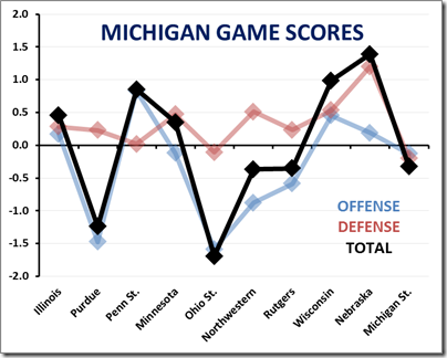
Here are Michigan’s game scores:
Even though Michigan lost to Wisconsin, it was still the Wolverines’ second-best performance in conference play; the Badgers are an offensive machine and Michigan held them to a respectable margin, even after they dominated overtime. Similarly, Michigan’s wins over Northwestern and Rutgers are seen as below average – a team should be able to handle opponents of that caliber much more easily than Michigan did.
So far, Michigan’s had five above average games (against Illinois, Penn St., Minnesota, Wisconsin, and Nebraska) and five below average games (against Purdue, Ohio St., Northwestern, Rutgers, and Michigan St.)
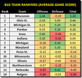
Taking an average of teams’ game scores is a better way to rank them than a simple efficiency margin ranking is, because this metric adjusts for opponent quality. (It does not adjust for home / away splits). This is how the Big Ten stacks up in terms of average game score:
To me, these rankings seem quite intuitive. Wisconsin is far ahead of the pack and Rutgers is far behind the rest of the league. Iowa and Indiana suffer from the same problem – their offenses are very good and their defenses are very bad.
Michigan St.’s defense is a good example of the strengths of this new metric. In raw efficiency numbers, the defense ranks first in the league – but their opponent-adjusted game score average on the defensive end is fourth. They did face Indiana and Iowa, but have not faced Wisconsin’s deadly offense; their opponents’ offenses have generally been average-at-best and they’ve faced each of the league’s three worst offensive teams (Maryland twice, Northwestern, Penn St., Nebraska, Rutgers, Michigan).
Michigan is 12th in the league in offense and 2nd in defense, which seems right.
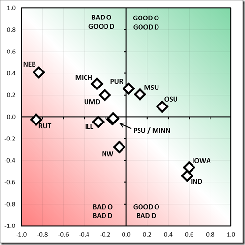
There are interesting ways of visualizing this new data, for example, the league’s efficiency scatterplot with average offensive and defensive game scores:
Wisconsin’s such an outlier that they wouldn’t properly fit on the graph (with an average offensive game score of 1.44). Nebraska’s possibly the most interesting result when considered spatially against their conference opponents – their defense is the best by a little bit and their offense is simply dreadful. Ken Pomeroy’s adjusted offensive and defensive efficiencies corroborate that (the Huskers are 298th nationally and 12 nationally in those respective categories).
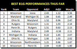
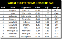
We can also look at the Big Ten’s best individual game performances, in order:
Click on images to enlarge
Unsurprisingly, Wisconsin’s rout of Iowa a few weeks ago in Madison (the “Woodbury eye poking and Dakich freaking out” game) was the best performance recorded by any Big Ten team this season. Michigan’s win over Nebraska was the 14th-best overall performance in conference play so far this season.
I’m sure that – as the season progresses – I’ll find more ways to think about, manipulate, and display this data, but I think it’s definitely a worthwhile exercise in attempting to more accurately assess how good teams have been in conference play.
As always, any suggestions are very much welcome.
February 3rd, 2015 at 2:14 PM ^
It fosters recursive thinking apparently
...I wondered if there was a better way to better way to quantify performance: that is, a better way ...
February 3rd, 2015 at 2:34 PM ^
February 3rd, 2015 at 2:35 PM ^
You can solve the problem of Wisconsin falling out of the scatterplot by indexing the scores (individual score – minimum)/range. That will get you a number between 0 and 1 for all teams. You also have the option to present a third factor on the chart using a bubble chart (size of bubble) if there is something else you want to include.
February 3rd, 2015 at 4:14 PM ^
Good idea. Can't think of a way to shoehorn any type of data into bubble size, but I'll try to think of something.
February 3rd, 2015 at 4:49 PM ^
Number of wins = bubble size could be interesting. It’s simple but it would provide a graphical way to see how this all drives victories. We would expect Good O/Good D to have the most but does Good D/Bad O have an advantage over Bad O/Good D? I would index the win number as well because a bubble with size 10 vs. a size 2 will tend to cover each other up.
February 3rd, 2015 at 4:25 PM ^
Nice job. I'm sure there's something in there about D being predicated more on effort and discipline, while O correlates to experience.
It would be interesting to see where the top 10 games (best overall, O, D, worst) ended up for past seasons, although maybe that's more of an offseason endeavor.
February 3rd, 2015 at 5:03 PM ^
Yeah, compiling that database would take a while, but definitely a good idea to look at it in the offseason.
February 3rd, 2015 at 10:26 PM ^
intense read. Never thought we would be in the "bad O good D" category.




Comments