The Best of the Only Incompetent Germans

It started off so well.

Mantras sewn into the fabric, apparently less intrusive piping, nods to the helmet stripes. The only ominous sign was marketing people who insisted on brand-specific copy errors.
Then they tried to lick our moisture:
…and things began to fall apart.
[After the jump: crimes against fashion, crimes against yellow, crimes against offense, crimes against eyes, crimes against humans]
The Battle for Maize
The first sign that not all was right with the maize and blue was something not right with the maize and blue, specifically with the continuing highlighter-fication of "maize":
Those are from user Wolverine Devotee's screengrabs of t-shirts in online stores. Nailing down exact shades of then and now is impossible because the vagaries of cameras/lighting/fabrics etc. I submit for evidence that my c. 1999 gameday t-shirt looks just like that next to students in modern official shirts.
Our best evidence of a dramatic yellow shift was pre-2012 banner versus various teams (2009 below) running under it:

Iowa games, since their yellow is also meant to be a reference to corn, are a good opportunity for comparison:

Anecdotally,
 .
.
This went back before Adidas. It also became much worse under them. Two years ago we started to hear rumblings that Brandon wanted the highlighter creep to stop; obviously it didn't.
Poor Upchurch had to requisition a new lens because the uniforms were too bright for his camera. But the Only Incompetent Germans wouldn't be happy until even the retinas of human eyes were burned:


-------------------------------
The Basic Function of Clothing Provisioning
Before getting into aesthetics, an athletic clothing manufacturer has only a few functional things it needs to accomplish. It must prevent exposure and indecency, and to their credit we didn't have any Wolverines freeze to death or show anything more risqué than our athletes' spectacular abs. However there were a few rather basic things that did not go well:
1. Have numbers that are legible outside the boardroom.
The uniformz they debuted for Alabama were a bit heavy on the yellow and forever associated with Jerryworld. So alternates for the ensuing Outback Bowl, in addition to matte helmets, went blue on the shoulders and "yellow" with the numbers. The result(you may not want to leave this running, especially if your name is Vincent Smith):
The UFR from that game (yes, Brian actually did a losing bowl game UFR) gave up on identifying who's who.
2. Put all the players in the same uniform which 3. Doesn't hinder their play:
From a mailbag in 2011, emphasis mine:
On the armpit jerseys never dying.Any thoughts or ideas as to why the defensive linemen switched to the road jerseys of the RR regime in the second half with the yellow piping? Also, Denard was wearing that one of those jerseys on the last drive. I like the look of this year's road jerseys without the yellow piping but wondering if if it is a fit or comfort issue although this year's home jerseys looked like they have the same fit with the wide, open arm-pit area.
Let's let another emailer answer this for me:
You've probably observed the same, but there are issues with the new Adidas techfits. I've seen them getting ripped to shreds at various points this season, and so you have guys like rvb, martin, roh, switch to last year's model in previous games. They were presumably asked to wear the new ones tonight given the more drastic change in appearance with elimination of the thick yellow piping. However, we've already seen rvb change back anyway despite the old piping.
I wouldn't normally care about this except for fact that underlying issue appears to be their tendency to be grabbed in a game-impacting way. Even fitz changed to the old jersey last game against Minn after being dragged down by the new techfit variety. We've seen the same thing happen to denard, although he hasn't switched. This is more annoying than anything else, especially to see potential big(ger) gains get stopped shorter than they should because some defender who was beat desperately was able to get a few fingers on some cloth.
We have seen a lot of guys dragged down by the jersey this year, haven't we? Could the Nike zealots have a point all of a sudden?
Apparently yes.

Clothing that contributed to fewer yards for Denard are tragedy enough, especially once his rushing yards for a quarterback record is assailed. But they also might have cost Michigan a game:
![PX00122_9[1]](https://mgoblog.com/sites/mgoblog.com/files/images/UV_12E38/PX00122_91_thumb.jpg "PX00122_9[1]")
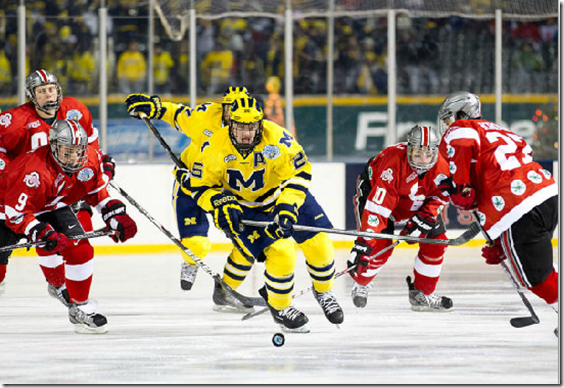
The turning point in the in-state rivalry was the moment Michigan came out in bumblebee clown costumes a seven-year-old wouldn't trick-or-treat in. Later when everyone in college football said it's pretty stupid we got a Sugar Bowl invite, we couldn't really argue, because that game and those uniforms were prima facie evidence that Michigan had surrendered its already tenuous claims to cachet.
The outrage over the ugliest outfits in the history of the program quadrupled when it was revealed that Michigan's coaches meant to change the game plan from "let's pretend Denard is Joe Montana" when they came out for warmups and found a trash tornado. When the team returned to their locker room, they found these travesties, and spent all that time getting everyone changed. Then they tried to pass deep 70% of the time.
Adidas's accomplices in 2011 Michigan State have been banished to Toys 'R' Us (Dave Brandon), San Jose State (Al Borges), and a national tour of spring practices to learn about offensive theories other than "Brawndo is what plants crave!" (Brady Hoke). In 13 months the final perp will be gone.
4. Also this clothing ought not to come apart faster than a Wal-Mart pillowcase, such as when the basketball team went to Minneapolis in 2013 and wound up in rags by the second half:
Trey Burke’s No. 3 was the first to rip, so he played most of the game wearing No. 12, which was also ripped later in the game. So after Jordan Morgan used Michigan’s second and only other extra jersey — the redshirt junior played the second half wearing No. 30 — Burke and, later, Caris LeVert were forced to play with holes in their uniforms.
If you're going to have tear-aways, at least send extras.
![gr3[1]](https://mgoblog.com/sites/mgoblog.com/files/images/Mailbag_12581/gr31.jpg "gr3[1]")
The same thing happened a couple of years ago in the rainy Northwestern football game, when half the team was wearing their old jerseys by the end of it.
5. Actually, sending them at all would be a good start. Remember the quarterbacks going through spring in (Nike) Oregon State jerseys with hastily-patched fake Adidas logos?

6. Pay people who work for you. Unfortunately they're not the only clothing manufacturer that gets into labor disputes with Indonesians, but usually they're not going to the mattresses over $1.8 million when their imagined loophole to get out of severance was laughed out of various courts.
And I know you're not allowed to pay players, but have some basic human decency to, for example, know not to capitalize off of injury to one of them:

-------------------------------
Uniformz Department: Football
The home uniforms that Michigan hasn't substantially changed since Yost were thankfully left alone except for subtle growth in logo size. Numbers appeared on the helmets for UTL1, finally got changed to the same yellow as the rest of the uniform for the 2012 spring game, and disappeared after that season. Adidas's take on the aways was to go with a thicker pipes at first, then those diminished in favor of a blue collar. I was fine with this:

But of course there were a few times they spun out alternates. The bumblebee travesty was discussed above. Those were inspired by the UTL things…

…marketed as "throwbacks," because the marketing plan for uniformz does not comprehend how the most radical change to a basic kit in 100 years was deciding to wear helmets. The "M" in the middle was a design element from turn of the century letterman sweaters:

1897 team/Bentley
The shoulders stripes were pure fiction. UTL ended well and from angles you couldn't see the stripes the uniforms were at least tolerable. Thousands of angry fans after the MSU debacle probably saved us from more of this until the Sugar Bowl.

Other than a pretty crowded chest and too-thin numbers these were actually pretty well received. Take note, Nike redesign team.
Dallas gave them an excuse to futz again:

 Other than the silly mitts the above weren't so bad except the shade of yellow in sterile Jerryworld made sure that top stripe glowed like the hoops things. Purists cared that the helmet stripes met in the back. They cared more when the helmets went matte in the Outback Bowl:
As mentioned above, the bigger complaint was yellow numbers are illegible on a white background except on pore-o-vision. The backlash was apparently strong enough that they left us alone for 2013, even UTL II. Stuff they did went back to subtle and underneath, e.g. Desert Storm camo undershirts and bandanas for The Game 2013.

But the empire struck back with the 2014 night game. If the one repeated demand from the fanbase was "DON'T EVER WEAR ALL MAIZE", what was clear to Adidas was they didn't say "all blue." Before we get to the blue pants, they showed us the shirt:

Neon runway tape numbers, more tape on the shoulders, and between them there are marks like our guys were run over by the airplane itself. The M's on the undershirts had lightning bolts on them, because while people with eyes might find this tremendously tacky, the players whose scholarships can be pulled if they speak out against the administration universally agreed that they came to Michigan for the chance to play with lightning M's on their sleeves.
Also blue pants.

By that point outrage was muted since fans were more preoccupied with deciding whether "supporting the players" meant firing Dave Brandon or lynching him.
Uniformz: Hoops Edition
Complaining about basketball is several orders of magnitude quieter. Fewer people watch, more games are played, and the game itself is less about tradition. That didn't prevent some weird:

A commenter will inevitably say the socks and shoes aren't as highlighter as they appear on my screen's settings and anyway they like them that color.
On the other hand the "throwbacks" were actually throwbacks, both the beloved '89 versions:

And my personal favorite, when they went back to the clean look of the Cazzie Russell era:


But it's not like any clothing manufacturer to be granted some leeway and not try to find just how far it stretches. So for one Wisconsin game, they tried ZUBAZZ:

Fortunately these were nixed after one game so the yellow version was never more than an extremely overpriced online store item:

The normal kits were an homage to the Fab five and thus pleasantly boring; I liked the darker navy they tried, but would have liked the 1990s to have ended before the hypercolor calves and shoulders:


Each year when March came closer we would fear the coming press release announcing whatever design all the Adidas schools had to push through various playoffs. I used to work for an environmental industry trade magazine, and started out by writing the new products sections. Companies would send me their jargon-y descriptions of RO filters, WESPs and RTOs, and being the Daily snob I was, I spent hours of my young career trying to turn those into English. At least they were selling complex equipment to engineers; I can't imagine what Adidas was doing with many of the same words in their "Made in March Uniform System" press release:
…uniforms feature a functional perforated print pattern along the leg of the stretch woven short to enhance breathability and ventilation, keeping players cool as the clock winds down. Adidas' quick-drying jersey technology found in current NBA uniforms along with ClimaCool zones on the chest, back and side move heat and moisture away from the body to keep the jersey light and dry as players sweat.

ClimaCool quick-drying perforated print pattern technology meets best available achievement standards and is an ideal solution for your water/wastewater needs.
Mercifully last year's March Marketing shorts didn't make it past the Big Ten Tournament:
 shoots past Illinois Fighting Illini forward Austin Colbert (31) during the second half in the second round of the Big Ten Conference Tournament at United Center. Mandatory Credit: Jerry Lai-USA TODAY Sports")
Before we depart Crisler, something should be said about the endless ammunition Adidas provided for the Izzone with the generic, occasionally not grammatical warmup tees:


As for hockey, Adidas couldn't decide what they wanted to be before handing off to subsidiary Reebok, who took things in a very Swedish direction:


Each line above is a season starting in 2010-'11; the last pic is last year when they finally settled on the clean block M design favored by everybody (including in that informal poll I conducted in my diarist days). The white they made an off-white that was too white so it just looked kind of dirty.
They did another for the Soldier Field game nobody went to.

Adidas/Reebok's major contribution, other than a Red-as-a-player-era throwback that was cool until getting a block M in Dave Brandon's Block M Brandification Mandate of 2012, was the infamously hideous Big Chill Wolverbear:

This sort of thing you could get away with in a postwar period when uniforms changes were made by the coach's wife and her sewing machine.

[Michiganensian]
When recreated by computer-guided lasers campy becomes grotesque. I will say of all the hockey outfits that have come and gone in the last 20 years, my favorites are the clean, modern maize:

Nike caveat: Ohio State wore at least as ridiculous stuff as anything above, and more often, and you have to figure Michigan will have as much say as the Buckeyes. At least half of the "uniformz" tag on MGoBlog is talking about another team, for example Ohio State's weird hockey things and colored helmets, and MSU wearing chrome hats and occasionally dressing like USF or Baylor when Nike insisted they have a third color.
is a kit?
Michigan kicked their ass on their court (AGAIN) when all their idiot fans had those shirts on.
These are enough missteps to warrant a change, especially the ripped jerseys, lack of timely replacements, and invisible numbers. However, I was fine with a couple of the football alternates, not the Bumblebees. And I like most of the basketball uniforms, even the Michigan Zumbaz weren't so bad on the players (Notre Dame's Shamrock Shake-look, though).
I'll continue to wear both brands, but it seems like Michigan made the right choice returning to Nike.
/waves at Moritz Wagner
"Highlighter" or at least bright yellow with a dark blue is more or less unique to Michigan right now. I don't want to look like Cal or WVU. It got a little too bright, but I don't want it rolled all the way back to Kraft Mac 'n' Cheese. Early 2000s bright yellow is just fine.
Sent from MGoBlog HD for iPhone & iPad
Sent from MGoBlog HD for iPhone & iPad
Ah memories. Thanks for the look back.
Am I the only one who just watches the games? I didn't even notice any of the uniformz after about 30 seconds of play (except the all yellow ones with invisible numbers).
all the fuss on nike vs adidas. still have to play the game. even if is in shorts. just a logo and money.
. I rented a Passat three years ago for a week when my Scion was getting repaired and it had 6,000 miles on it. The passenger "oh shit" handle fell off in my hand. Later I put down the driver's sun visor and it fell off! Unbelievale for a nearly new car. Those things are supposed to be bolted on relentlessly to avoid them becomming flying guillotines in the cabin during an emergency situation.I always liked Volkswagons and I always knew they were repair prone but never would I buy one based on that experience..
I think Harbaugh will keep it simple and traditional with maybe a throwback here or there.
Home: maize pants with blue swoosh, dark blue jersey with maize swoosh maize numbers with maize block M and maize swoosh left chest.
Away: maize pants blue swoosh, white jersey with maize and blue stripes on cuff blue swoosh blue numbers.
Socks: white
Shoes: white with black
Would be cool for a change up.
At least with the UTL I and bumblebees you got the sense they were trying to come up with something different.
You didn't get that feeling with the Bama/Outback design.
I'm okay with having the players decide what to wear as a reward for performing well, but not with then giving them three bad alternates and having them try to pick which one is least bad. Wearing that year's edition of the standard, classic uniform should always be one of the choices.
The current basketball uniforms are not, I don't believe, a homage to the Fab Five. This basic look has been around since the 1989-1990 team. The Block M uni was "retired" when they won the 1989 national title.
Also, it seems like the UTL uniform stripes were inspired by the 1891 uniforms, which had very similar stripes on the sleeves.
Isabella . if you, thought Rachel `s blog is neat... last tuesday I bought a brand new Subaru Impreza after having made $9569 this munth and even more than ten-grand this past month . it's actualy the nicest-job Ive ever had . I started this 4 months ago and right away was earning more than $82 per/hr . try this out++++++++++++++++++
++++++++++++
Comments